How to Achieve Distressed Gilding

When one says “gilded”, you envision a glossy shiny gold finish. But this is not always so; it is true that straight gilding is done by 1) applying a base coat, 2) brushing size on the piece (glue size is a liquid adhesive material to adhere gold leaves to a surface that is being gilded), and 3) placing gold transfer leaves.  Or, as explained throughout this post, one may prefer subtle gilding to transform, for instance, new-looking pieces.  In our case, we will turn a console and a wall sconce into old distressed (not destroyed) gilded antiques.

Before starting, you need to know precisely what look you are aiming to achieve – what shade of gold do you desire? What background colors do you want to reveal behind the gold? The chosen colors have to be harmonious to achieve fakery.  Faux finishing is not at all a happy-go-lucky trade.

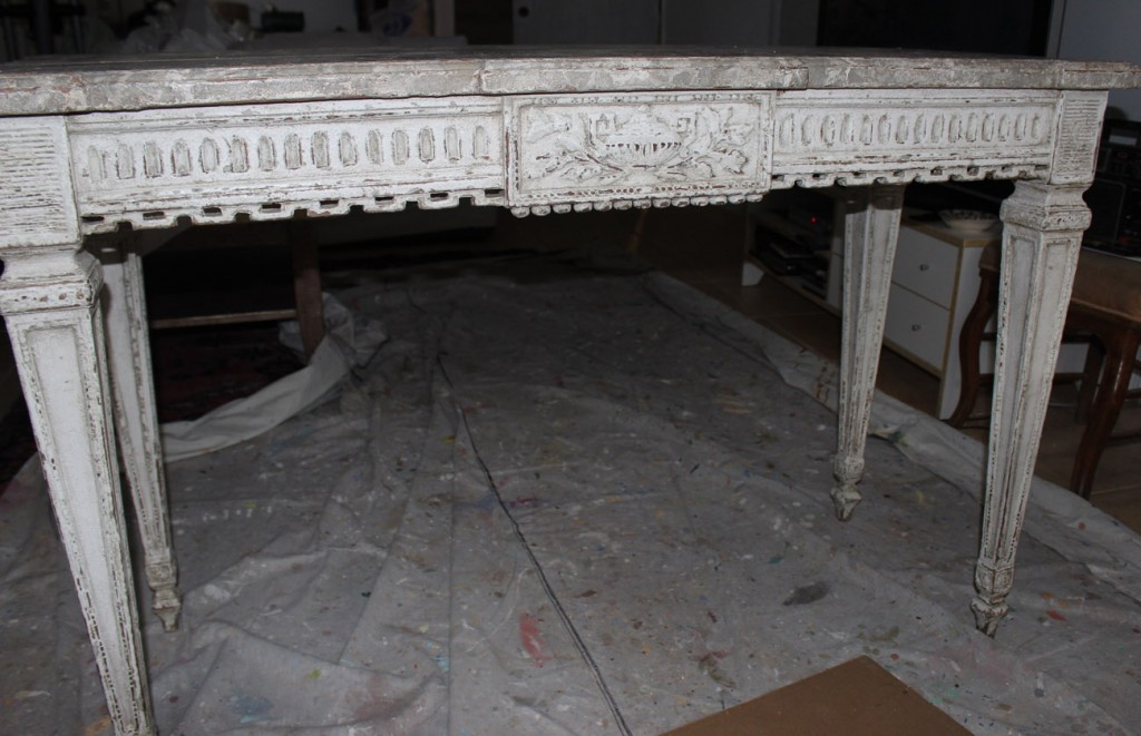
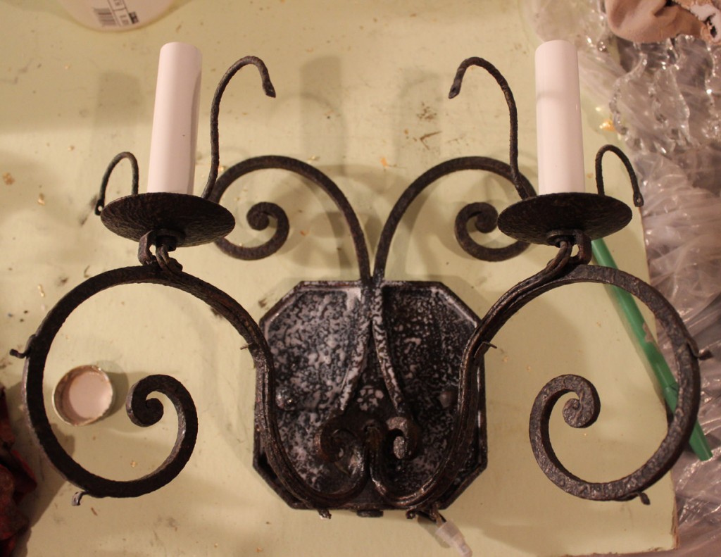
The consoles I worked with were white and the wall sconces were black.  Here are one of each below:

Original white console

Original white console

Original black sconce

Original black sconce

From the beginning I was targeting a seventeenth- or eighteenth-century look.  I would use a lot of dark grey and some silvery grey, then accompany those colors with a dirty brown simulating dirt accumulated over centuries.  On many gilded furniture, the gold base is blood red, which also yields wonderful results, but I wanted to explore a more discreet and authentic look.

Using Benjamin Moore latex paints, I started by coating the table with a tan-colored primer.  I then covered it by two dark bronze/brown layers of paint, applied next to each other in a patchy pattern. Once they were dried, I brushed the piece with Smoke metallic paint, ragging it off to leave tracks of it only in the recessed parts.  Again, I waited for this coat to dry to randomly apply a layer of iridescent gold that I also partly ragged off, but this time, I left some of it onto recessed as well as raised parts.

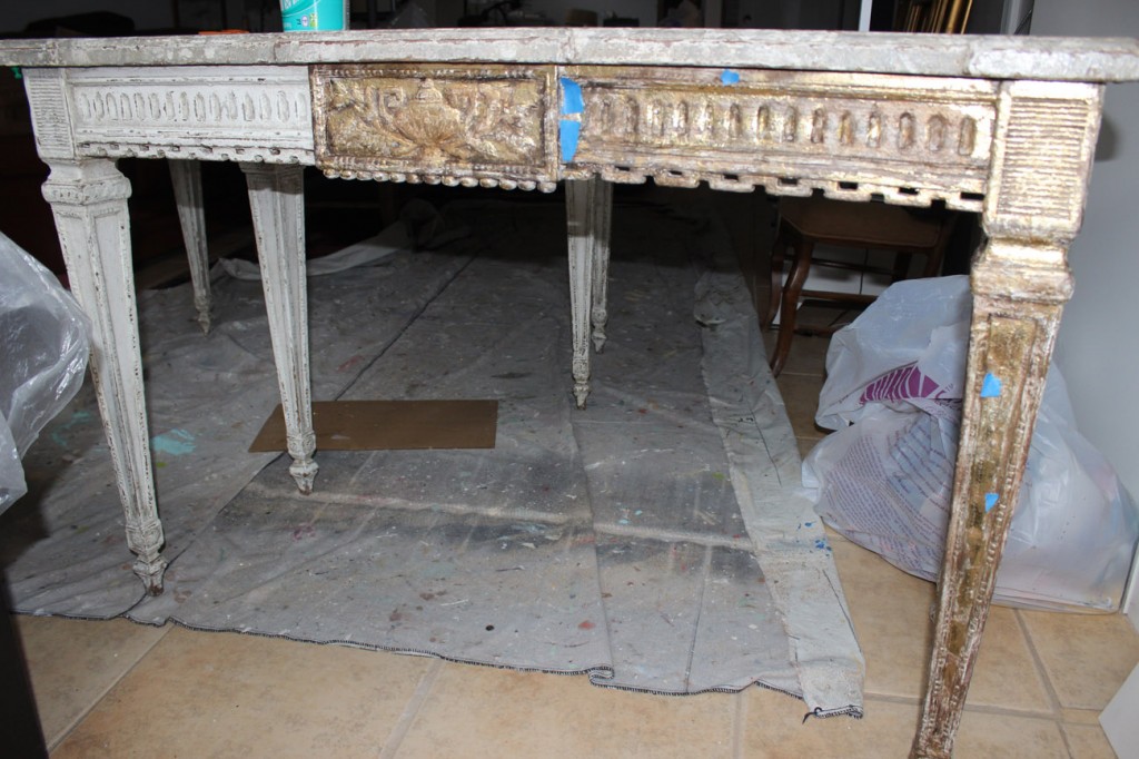
Once the base coats were thoroughly dry, I brushed size all over the pieces. Approximately one hour after its application, the size still being tacky, I started applying the gold leaves. Different gold leaves are available in art stores.  Some are regular squares coming in every shade of gold.  The variety I picked was pale gold, with a peculiar consistency that disintegrates as it comes in contact with the size.  As a result, when gluing the entire square to the piece, only fragments of the leaf adhere, leaving irregular tracks of gold that simulate a distressed gold finish.

Beginning the aging and gilding process

Beginning the aging and gilding process

I repeated the application many times until I felt that enough gold had been applied.

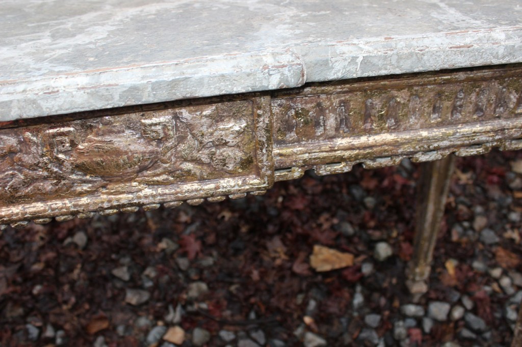
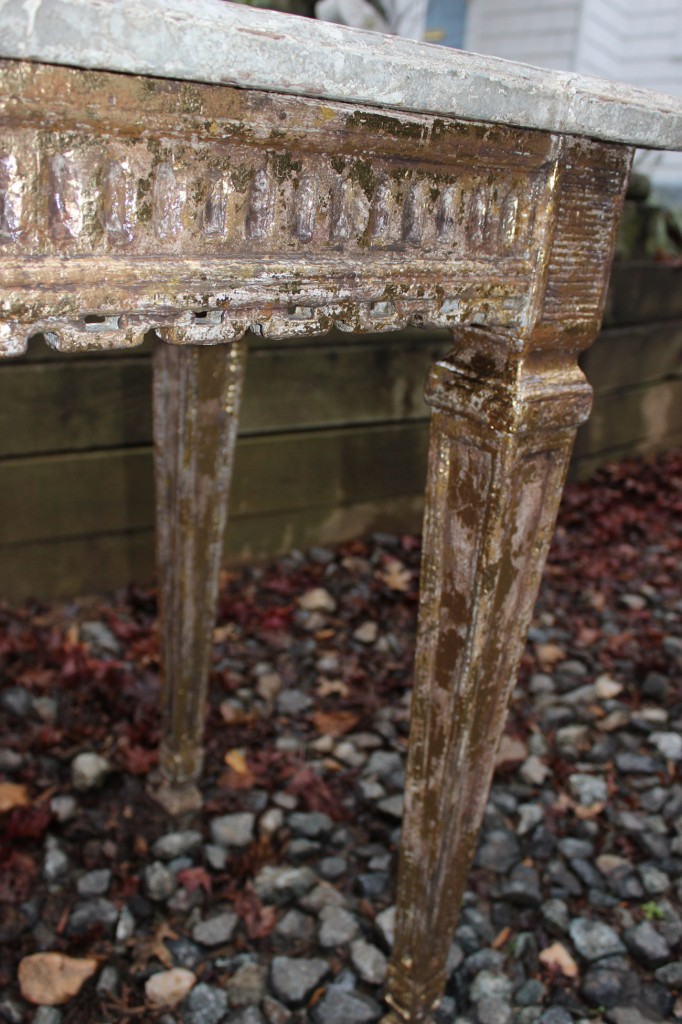
Detail of distressed gilding on apron of console

Detail of distressed gilding on apron of console

A certain amount of gold had to be applied to convey a rich and intriguing shine, set out by the various undercoated tones.

Detail of aged gilding on legs

Detail of aged gilding on legs

The next step was to age the gold leaf by rubbing (burnishing) a diluted dark grey brown latex paint on its surface and ragging it off to preserve the gold shine and mute the recessed parts.

Detail of aged gilding on the apron of the console

Detail of aged gilding on the apron of the console

I aimed to demonstrate that the quality of the gilded piece was still dominant despite the defacing it incurred from the passing of time.

At last, the newly faux finished furniture/object received a water-based varnish, with semi gloss sheen, to protect them.  Et voilà, that’s how it’s done!

Finished result of distressed and gilded sconces

Finished result of distressed and gilded sconces

As a final remark, I will add that one should expect the gold metal leaf to yellow a little bit more than its original tone.

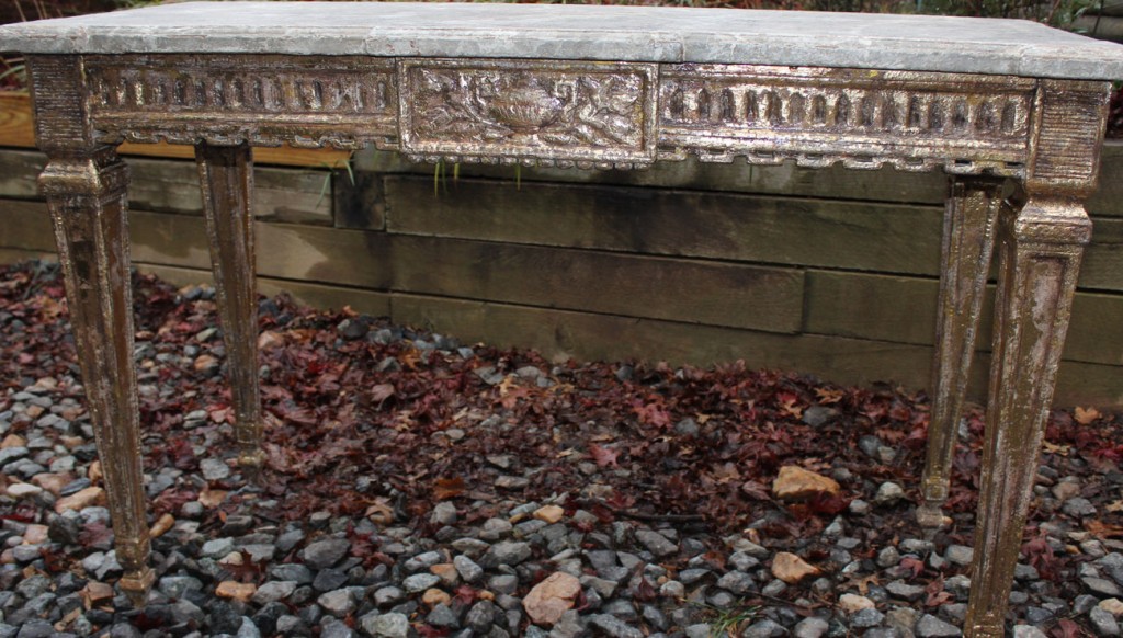
One of the distressed.and gilded consoles

One of the distressed and gilded consoles

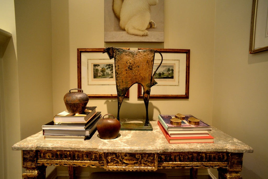
The consoles can be placed side by side with any valuable collectibles.

Second finished console with its aged gilding

Second finished console with its aged gilding


Leave a comment

Decorative Painting for Restaurants

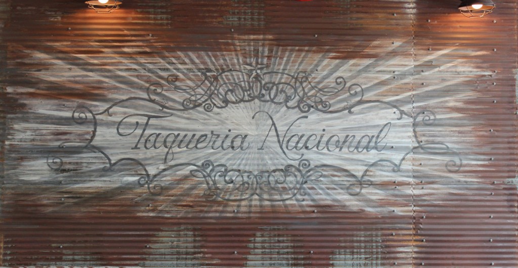
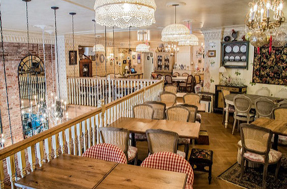
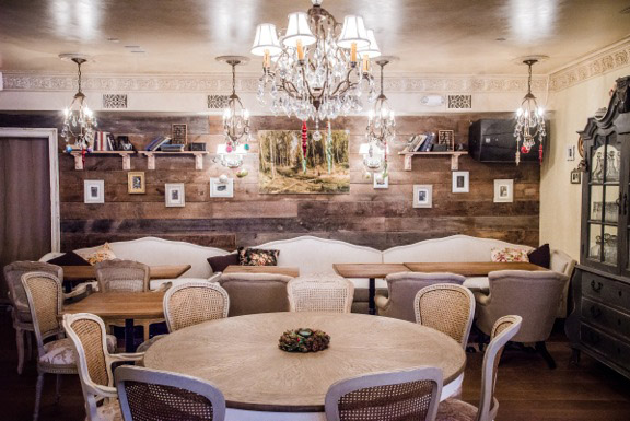
Who said that using distressed finishes to transform restaurant walls was passé? Lately, to recreate a post-Russian revolution ambiance at the Mari Vanna restaurant in Washington DC and to implement a traditional Mexican décor in Taqueria Nacional, I executed unusual décors and faux finishes on walls, decorative woodwork, wall papers, bricks, chandeliers, and other objects.  The result was exceedingly original, cordial, and fun.  For the Mexican restaurant, over rusty corrugated metal sheets I reproduced an old “Taqueria” (taco eatery) design sign.

Distressed sign painted on old corrugated metal

Distressed sign painted on old corrugated metal

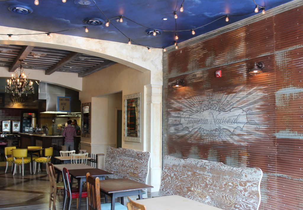
In Mexico, traditional store signs had popular designs with flowery calligraphy, curvaceous fonts, and vibrant colors to catch the customer’s eye. These signs, typical of the “arte populares”, are incredibly artistic and fresh looking compared to their rigid American or European equivalents. Here are two pictures showing the effect cast by such a sign and the ambiances set by the beautifully-executed distressed décor.

Restaurant sign painted on corrugated metal with bar in the background

Restaurant sign painted on corrugated metal with bar in the background

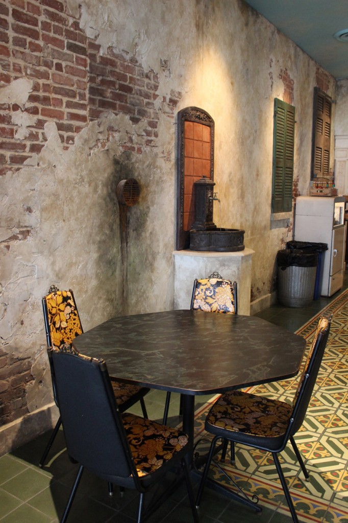
Restaurant distressed walls with traditional cement floor tiles

Restaurant distressed walls with traditional cement floor tiles

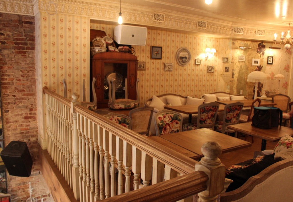
At Mari Vanna DC, The Russian restaurant interior was entirely distressed from floor to ceiling on three levels, including fixtures tiles, furniture and other objects, to emulate a former grand house chopped up into community apartments, as well as to bring a flair of a Babushka’s (Granny’s) apartment.

Overview of distressing work on ceiling, moldings, wall paper,chandeliers and trims

Overview of distressing work on ceiling, moldings, wall paper,chandeliers and trims

I started by ageing the ceilings and the cornices with a putty-colored glaze, indeed smoky or dirty looking.

Glazed restaurant ceiling and aged chandeliers.

Glazed restaurant ceiling and aged chandeliers.

The cornices were treated with gradient hues to underline the molded leaves and patterns of their design.  On some of them up to four colors were used and featured a dash of bronze or gold.

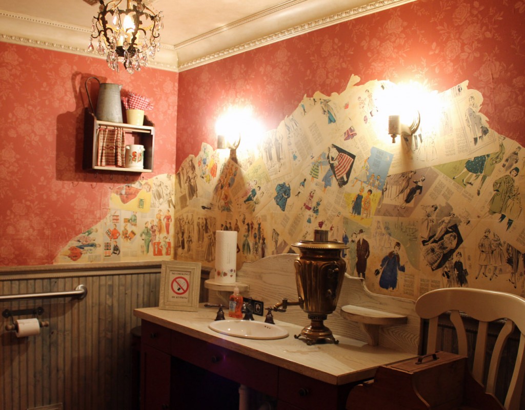
Distressed crown moldings and wall paper.

Distressed crown moldings and wall paper.

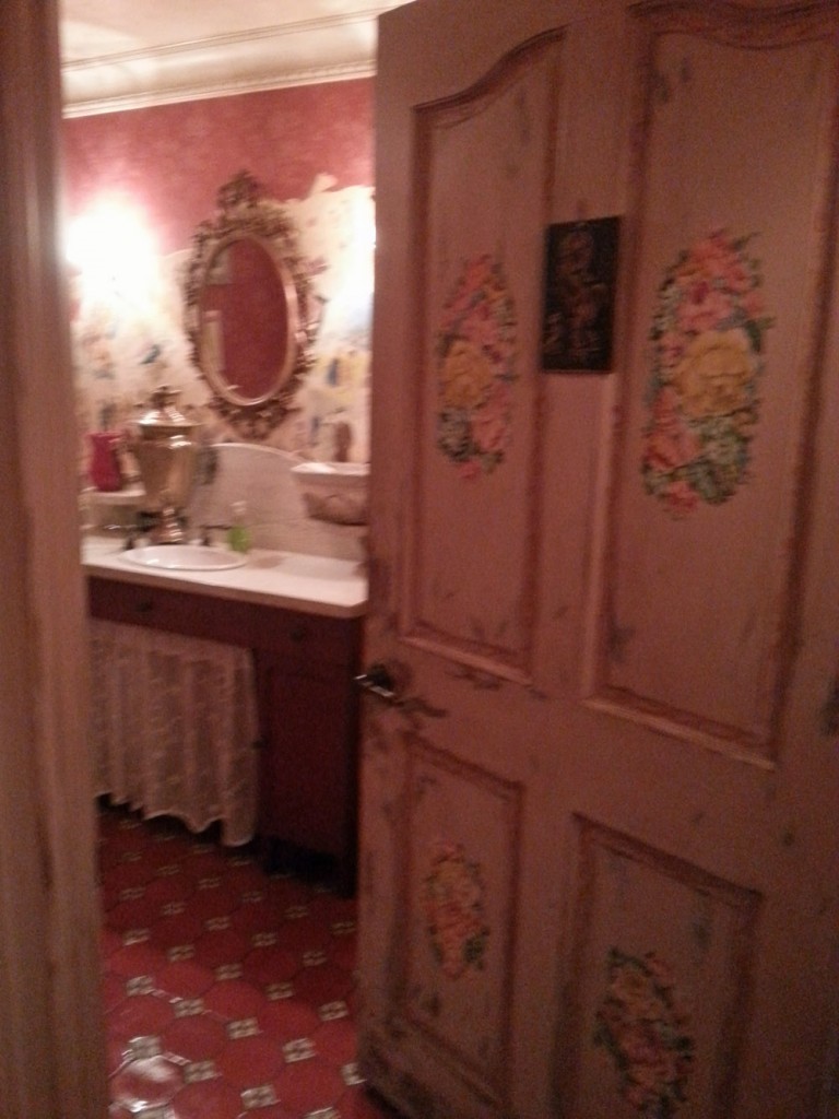
The same treatment was applied to the rosettes. The bathrooms’ pine wainscots were stained with a grayish medium to imitate faded wood.
Distressed door and walls.
Distressed door and walls.
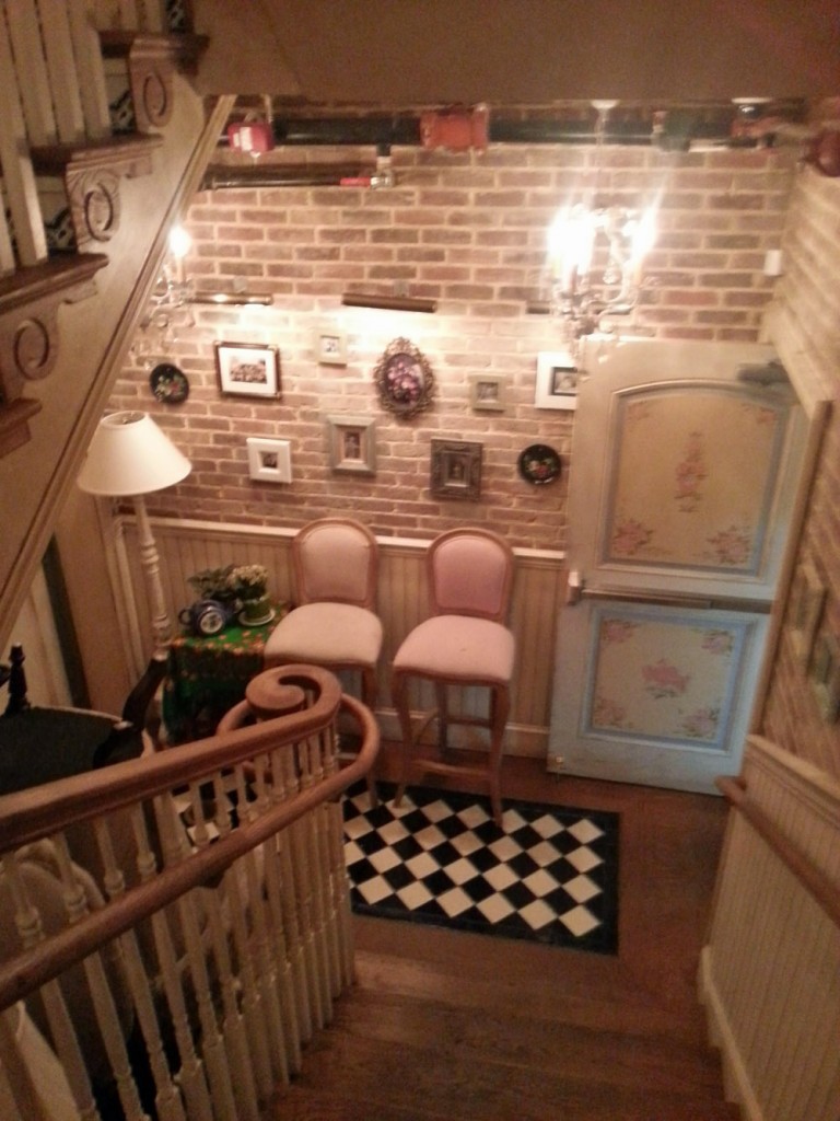
The stairway wainscot as well as every door, trim, bar and shelf were painted, partly sanded down to the wood, then stained.

Ambiance set by distressed brick walls, and woodwork.

Ambiance set by distressed brick walls, and woodwork.

Similarly, I tinted the wall papers with dry Sienna powder and burnt umber to reproduce the passing of time and mildew. To age the entire brick stairwell I used five different tints giving the bricks a dusty and faded look. At last, I faux finished the chandeliers and wall sconces to simulate antique ones. The faux finish work allied to the materials used all over the restaurant, such as old barn wood, tufted fabrics, flowery wall papers, 1950s original magazine clippings and newspapers pasted on the walls, contributed to creating a very warm, comfortable, and whimsical décor.

Aged wainscot and distressed crown molding and magazine clippings.

Aged wainscot and distressed crown molding and magazine clippings.

Once the faux finishing work was completed, Russian artists added finishing touches by painting traditional Russian folk designs on doors and furniture. This exceptional décor was conceived in every detail and led from start to finish by Moscow-based designer Gulia Ismagilova. The restaurant décor is so hearty that it definitely opens your appetite… for more faux finishes!

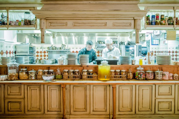
Distressed bar and shelving.

Distressed bar and shelving.

Leave a comment

How to Give a Built-in Bench a Swedish Flair

What do you do with a long built-in bench when you can no longer bear it’s sight?  You may wish to embark on a totally different look, unless you are restricted to a color theme that matches the wall or other decorative elements in the room, which was our case.  The bench was in a large pale yellow kitchen cum living room area.  On one side of the room, above emerald green tiles was hung dark olive green stained cabinetry.  On the other side were cherry color and taupe couches.  Introducing an additional color would have been bold, and my client wanted to tie the cabinetry to the bench.  This is why we decided to stay with a much lighter green that would not conflict by the same token with the pale walls.

Dark green built in bench

Dark green built in bench

Painting of first white stripe

Painting of first white stripe

Instead of applying a plain lighter shade over the bench, I sanded the surface to smooth it, to get rid of most of the dark green, and to reveal the previous coats of paint.  Indeed, the under coat was a much lighter green.  I stopped sanding when three quarters of the dark green were removed, exposing the remainder in a lighter background.

Afterwards, I picked two different light greens: one on the yellow side and another on the blue side.  I diluted each color with the same quantity of Floetrol and brushed one color over the entire surface, removing part of it with a rag as I progressed.  I repeated the process with the other color.  Eventually, I obtained a very soft pastel green built up by several shades of green.

Bench with pale green background

Bench with pale green background

The bench still looked monolithic; in order to break its mass, I had to add a geometric, floral, or gingham pattern, for instance.  I decided to go with horizontal stripes, keeping it fresh and simple.  I introduced three stripes.  I again used a diluted mix of vanilla color and applied two coats of it over each stripe.  The vanilla actually looked off white.

Stripes before the design

Stripes before the design

Once the stripes were dry, I sanded them to remove half of the white paint, giving a more distressed appearance to the three bands.

Plain stripes on bench

Plain stripes on bench

At this point, with a fine liner brush, I painted two simple designs inside and on the edges of the stripes in a darker olive color to break their monotony.

Detail of design on bench.

Detail of design on bench.

Again, the color I used was diluted to give a worn-out effect and to soften it.

Finished bench

Finished bench

Finally, I varnished the bench with three coats of satin water based varnish.  The finished piece is reminiscent of Swedish faded pastel furniture, and matches the cabinetry with its dark design accents.

Bench integrated in the kitchen

Bench integrated in the kitchen

It now just awaits cushions and customers.

1 Comment

How to Execute a Faux Tortoise Shell Finish

Tortoise shell finishes are one of the most difficult faux finishes to execute.  In this post, I will explain the process step by step, and hopefully provide enough guidance for you to get started on your own imitations.

For centuries, the rich and mysterious colors of the tortoise shell have lent themselves to a multitude of imitations.

The shell of the tortoise comes naturally unappealing.  Depending on the tortoise’s geographic origin, its shell can be characterized by blotches of dark nuances bathed in a green, brown, or sometimes almost black background.  Only a special treatment (i.e., chemical treatment) of the shell reveals its beautiful stripy pattern and tints.  To accentuate these traits, shells on furniture were often inlaid over sheets of gold, silver, or other bright colors.

Historically, tortoise shells were not a common staple, and unless purchased as antiques, tortoise shells today are not available for sale legally.  However, their sumptuous designs can be made available through imitation.  In the world of decoration, we traditionally come across two colors of tortoise shell: yellow and red.  Spectacular examples of the red ones appeared during the Renaissance period in Europe and in the Far East, on frames and furniture.

This being said, overlay tortoise shell can appear with much serendipity in various hues, ranging from turquoise to carmine.  As long as the effects of transparency, depth and flecked pattern are reached, it remains extremely decorative.  Its most common applications are seen on:  boxes, frames, mirrors, and furniture (vignettes).  On walls, large squares of it bring a luxurious look, and can be equally fitting in a modern or classic interior.  I once divided a ceiling into 40″ dark turquoise and black tortoise shell squares, and finished the surface with a high gloss varnish.  The result was splendid, and fun.

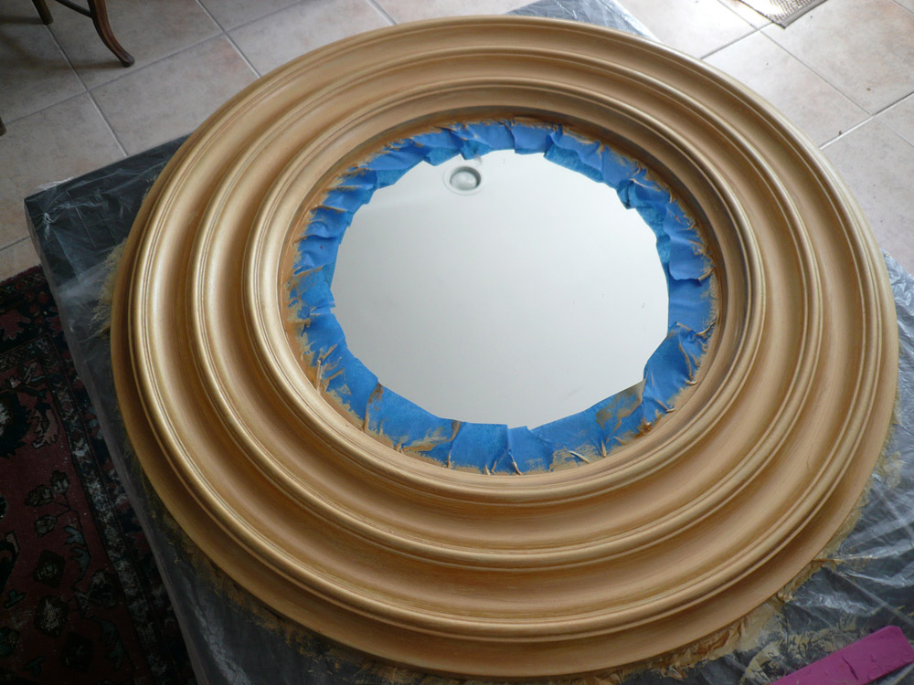
Underneath are the basic steps for achieving a yellow tortoise shell pattern.  In my project, I used oil-based glaze and fine artist oil paints.  It is best to work along with an original piece of tortoise shell,  or an excellent reproduction as a guide. I prefer the oil to the acrylic medium for this type of finish. My surface was a small 24″ round mirror frame.

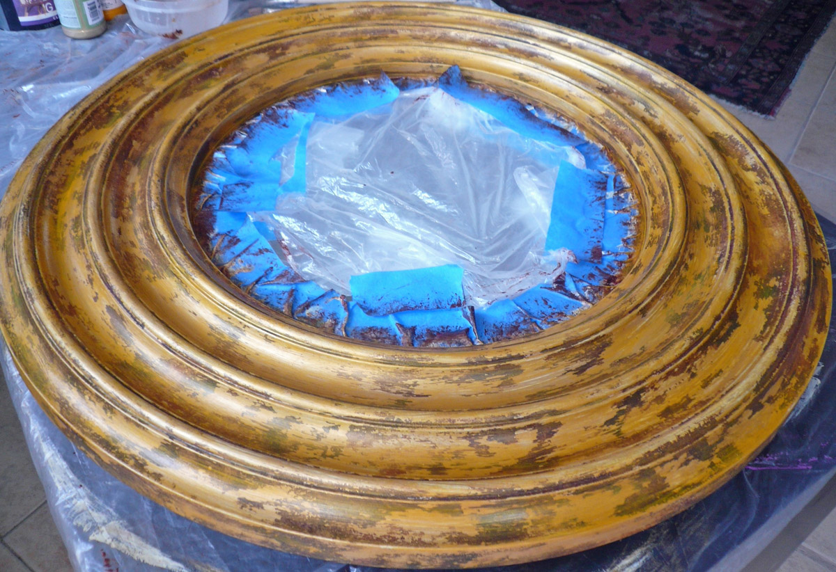
Metallic gold paint over ivory color.

Metallic gold paint over ivory color.

  1. The surface of your project must be perfectly clean, smooth and flawless.  If it is a raw wood, it must be gessoed and sanded.  Paint the surface with a latex or oil-based bright yellow, similar to a buttercup. You may have to lay several coats if the base is dark. Lightly sand each coat or rub it with steel wool.  Add one more coat of bright gold metallic paint (“Olympic gold” if you use the MM (Modern Masters) brand), or apply a mixture of metallic gold with latex yellow paint.
  2. Depending on the size of your project, you may want to divide the space into small squares or rectangles of 3, 5 or 12 inches. Given the size of a tortoise, small pieces of shells are easier to work on at a time and are more credible.  This would also allow you to vary the patterns or sizes of the spots more easily.  On my frame, the ridges made it difficult for me to divide the surface.  Nonetheless, it could have opened another design avenue.  Moreover, I would not recommend this faux technique over curved surfaces: it is feasible but very challenging!
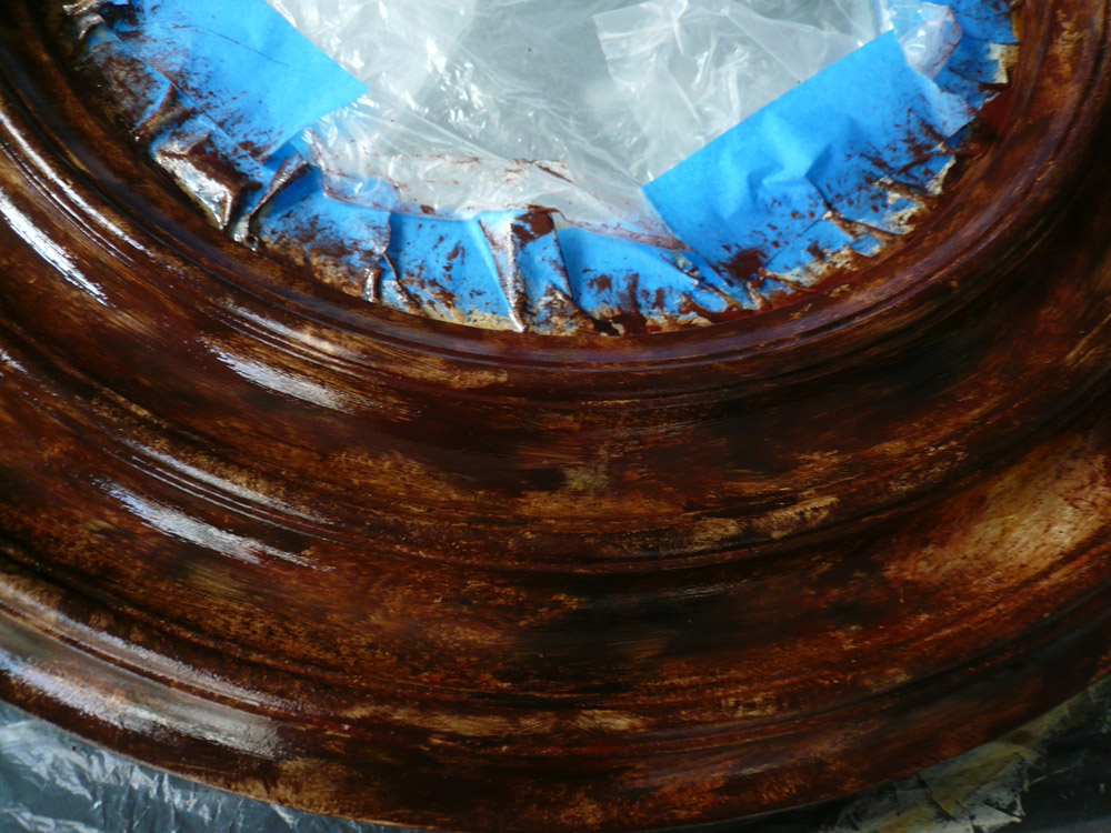
  3. Before coating the frame with glaze, place a little bit of Raw Sienna, Burnt Sienna, Burnt Umber, and black into separate containers.  Each heap of color should be slightly diluted with turpentine or mineral spirit. Their consistency must remain creamy.  Afterwards, dilute oil glaze with kerosene or mineral spirit and fine linseed oil.  Coat your project with this glaze.  With a small artist brush, sit a dab of Burnt Sienna sparingly, in a random pattern, following the model of tortoise shell that you want to imitate.  Leave many areas untouched.
Metallic gold paint over ivory color.

Metallic gold paint over ivory color.

It is important to let the bright gold show through.  You do not want a muddy finish; it should look neat and clear, although a little blurred.

More gold needs to be exposed

More gold needs to be exposed

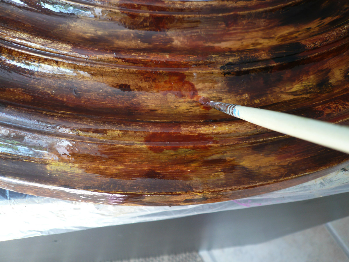
Add fewer patches of Burnt Sienna and Burnt Umber, next to the Raw Sienna.  Hold your badger vertically and hit the Raw Umber with it, then gently hit virgin spots on the surface to” walk” the dark tint in tiny flecks.  Clean and wipe your badger and soften the surface with it, very gently, in one diagonal direction.  Clean it again and repeat the softening part if necessary.  You may need to add more of this tint, or some black.  If you went overboard with the colors and they conceal the background, with a clean rag wipe some small areas, add more glaze, and rectify the pattern.

Depending on your result, you may want to wait one day and repeat the glaze application, followed by more of the same or different colors.

Adding indian red on top of glaze

Adding indian red on top of glaze

It usually takes three coats of glaze, or three days, to reach the desired effect.  If you concentrate the entire applications on one day, you will obtain a glaucous look, unless you opted for a sparse spotted finish.  Similarly, if you are satisfied with the results of the first round applications, you may want to wait one extra day just to add the tiny dark flecks that will not disappear a midst the other colors as you badger the surface.

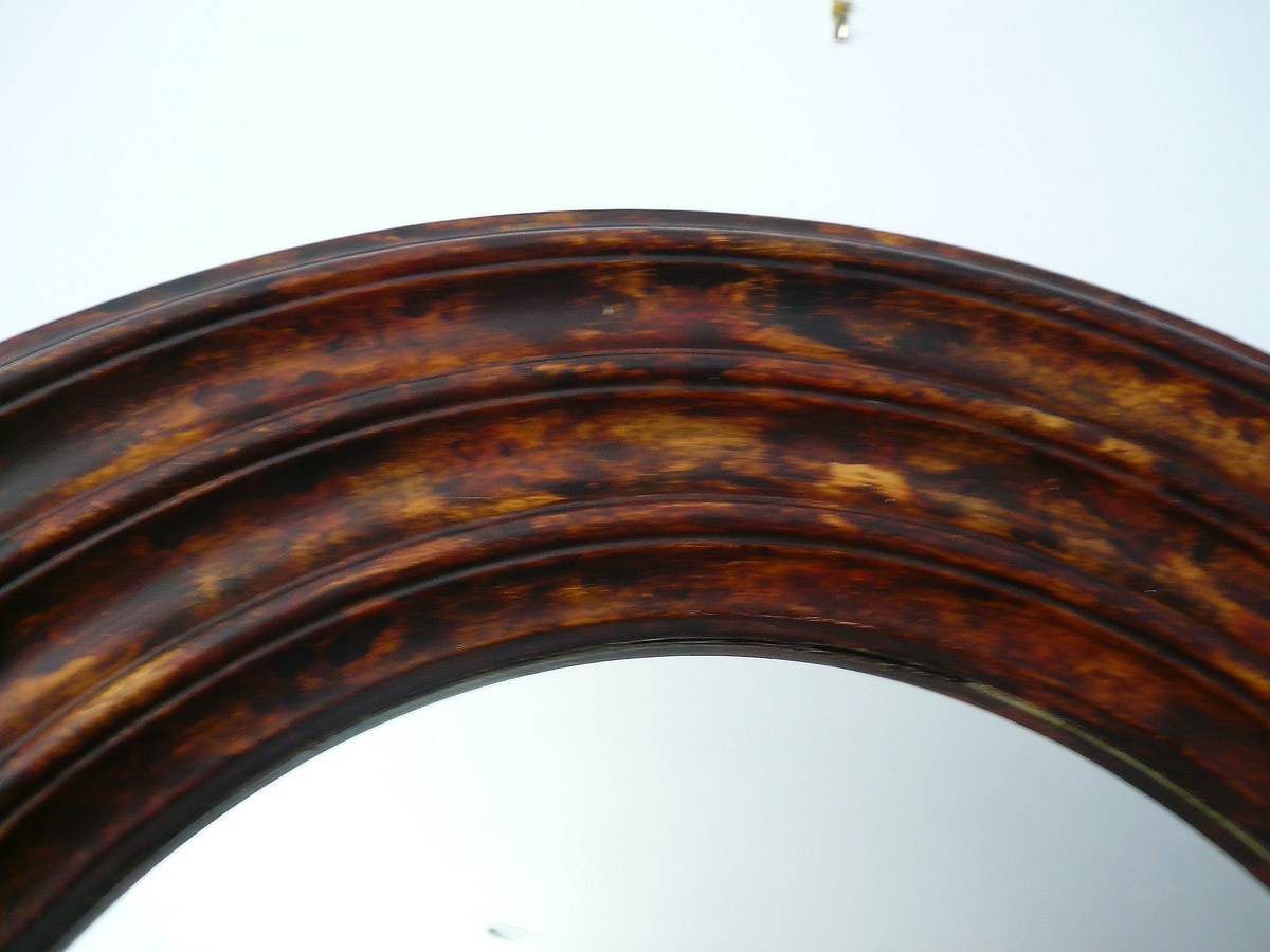
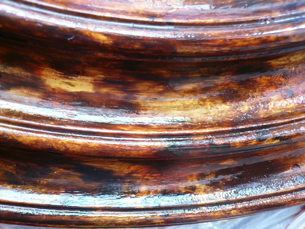
Final tortoise finish (detail)

Final tortoise finish (detail)

It is always best to isolate each layer, and not to rush. Each dried layer has to been sanded with very fine steel wool or 400 sand paper.  When you are ready to varnish, use a semi or high gloss varnish to enhance the various colors of your work.

Final varnished tortoise shell finish.

Final varnished tortoise shell finish.

Use an oil-based varnish of very good quality, in spray or from a can. If you have applied a latex or acrylic paint, you may use a latex varnish to seal your work.  A minimum of two coats of varnish will be necessary.  Again, rub the piece with steel wool between each coat.

Enjoy your chef d’oeuvre!

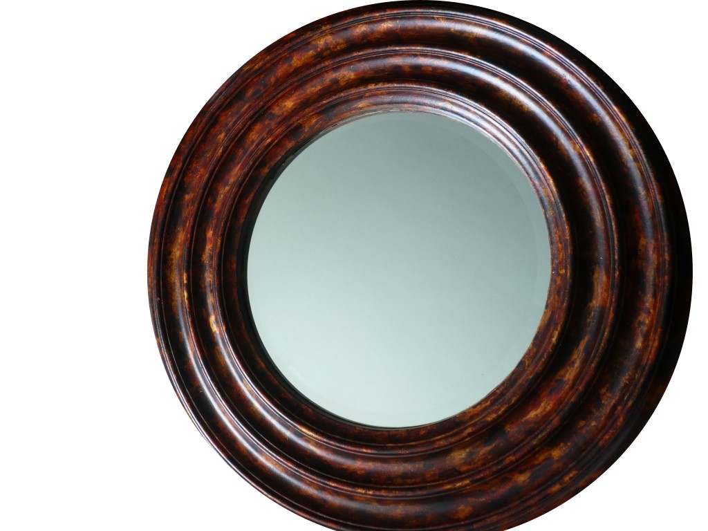
Mirror completed with faux tortoise shell finish

Leave a comment

How to Imitate Wood: Pickled White Oak Grain

If you want to realistically imitate a wood essence, you need to have several samples of it at hand and to study them in depth. First, observe the different hues of the particular wood, then its pores, its veins, and its wood grain.  Note that, depending on the wood cut, the same tree may yield different patterns and colors.  Similarly, the pests or diseases that may have infested the tree also contribute to the wood’s distinctive look.

I will attempt here to describe in a few steps how to imitate a pickled European white oak. Pickled means that an off white or white wash was rubbed onto the wood pores to lighten the overall color.  This makes the pores more visible.

To complete this faux oak wood imitation, you will need the following tools: one large 4″ or 5″ brush and several smaller ones, one fine artist brush, a badger, a flogger, assorted metallic combs, a metallic roller, and a foam roller.  You will also use rags, various containers, sand paper, and a plumb line.

  1. On a very smooth and impeccably flat surface, apply two coats of a light pinkish “cafe au lait” base coat using latex or oil-based paint. Sand it lightly. If you wish to simulate a plank pattern — where it appears as the walls were paneled by successive wooden boards, this is the moment to trace the outline of each plank with a pencil.

    Base coat with plank spacing.

  2. Draw the figures of the wood grain using washes of various colors: pale grey blue, peach, creamy yellow, medium grey, and medium chestnut brown. If you have elected to create a board pattern, try to subtly differentiate each board using different colors or drawings.  For instance, you may accentuate colors or patterns alongside their borders.  Wait several hours for the latex paint to dry or one night for the oil-based paint.

    Drawing of wood grain over the base coat

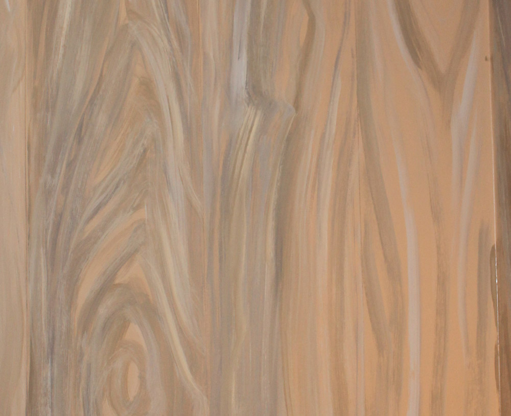
  3. Apply a medium chestnut brown glaze with a large brush. It must not be runny at all.  I use an oil-based glaze for this finish to gain more open time to work the surface. Flog the entire surface. You need to prepare ahead of time a little mixture of reddish brown artist oil mixed with glaze or turpentine.  Prepare the same in steel grey. The mixes should be creamy. With a fine artist brush, go over some of the wood grain designs using one or both mixtures to accentuate knots, circles, and veins. Afterwards, badger and flog your lines.  The lines must remain discreet compared to the surrounding colors. Once you are satisfied with your work, pass a metallic roller over it and comb it with the narrow teeth steel comb. Proceed very gently: your wood imitation has to be soft and subtle, not caricatural, unless you are trying for the country rustic wood graining look. Wait one day before starting the next step.

    First coat of brown glaze over door

  4. Prepare a vanilla color oil glaze and apply it with the large brush on the surface. Flog it carefully, going back on the spots that were not finely flogged. With a thin rag, remove some of the glaze inside the knots, to give them more depth. They should look neat, not blurred.  Lighten some areas if your sample shows more defaults or lights. Your work must be delicate. Comb again the entire surface, barely pressing on the comb. You should not have a clear striation pattern.  The overall effect should reminisce of a short hair fur, in the light grey/hazelnut hues. Let dry the surface one more day before the finishing touch.

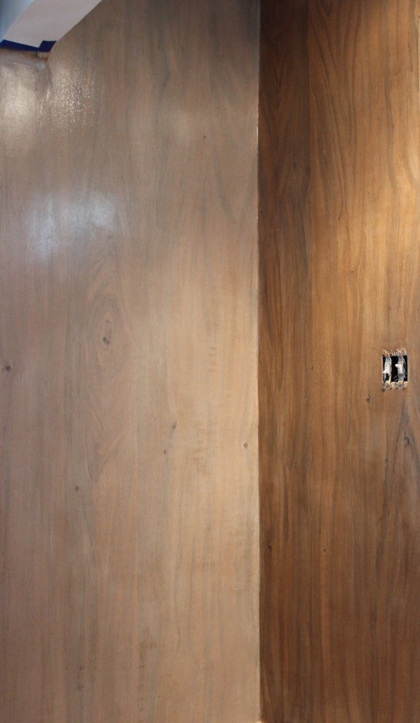
    Left wall with unflogged white glaze, right one with brown glaze.

  5. If you have laid a board pattern, you may want to accentuate or widen the separation lines one last time with a pencil. Equally, it may be necessary to go over the knots that may have slightly disappeared under the last whitish glaze.  In this case, only the edges of the knots have to be underlined. Your pencil line must remain natural.  Once you are satisfied with your production, you may wish to varnish the faux wood for two reasons: to protect it if it is located in a busy area, and to give it a flat sheen. Similar to drift wood, pickled oak has no sheen. The glaze however leaves a shiny sheen, whether it is oil or water based.
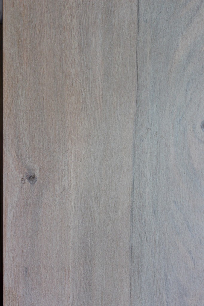
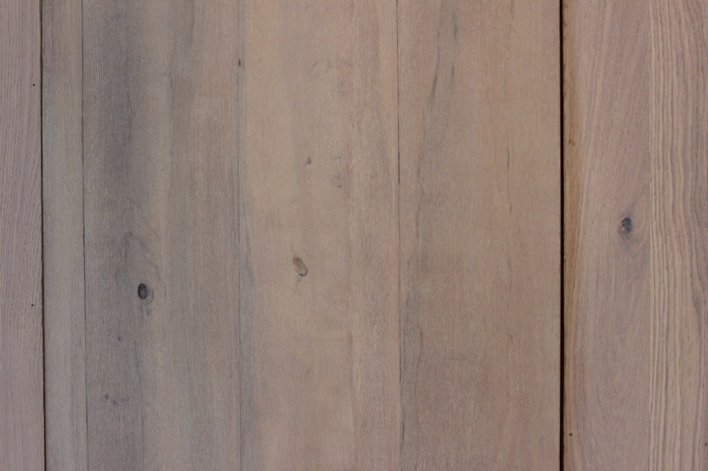
Detail of faux pickled oak

Detail of faux pickled oak

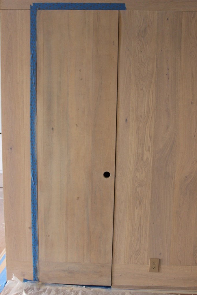
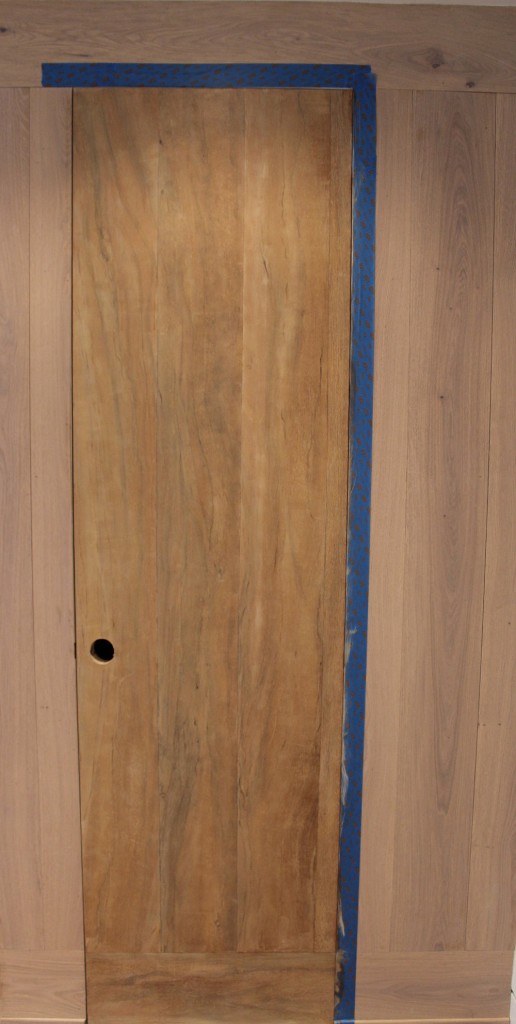
Central door panel is faux wood

That’s it!  Now, you can enjoy a beautiful wood interior without depleting the earth of its resources!

Completed oak graining on door

Completed oak graining on door

Leave a comment

How to Enlarge Your Kitchen Space

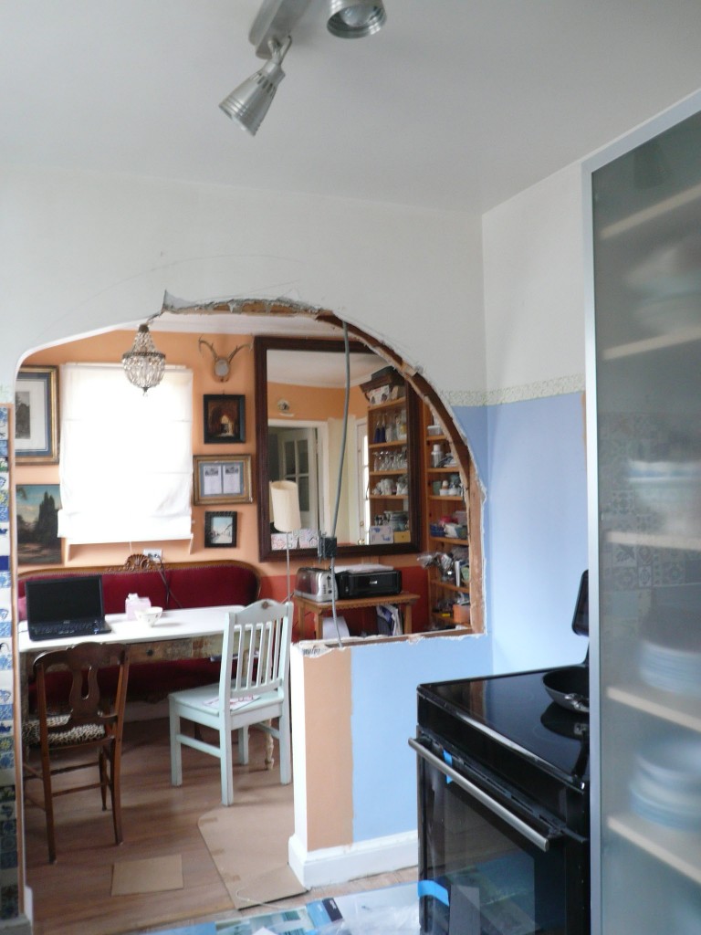
Original kitchen separated from breakfast room

Original kitchen separated from breakfast room

Many homes display a breakfast or morning room adjacent to their kitchen.  Nowadays, the need for this extra small room is being challenged: larger kitchens join practicality to conviviality and  they are better suited to children and entertaining needs.  Besides, a series of small rooms is aesthetically less appealing than a flow of larger spaces.  For these reasons, I took on demolishing a partition wall between a kitchen and a breakfast room, and I strongly recommend this rewarding transformation.

If you are decided to move forward with such a project, you must address three issues before demolishing:

  1. Find out if the partition wall is a supporting wall,
  2. Find out what could be buried in the wall,
  3. Design the new opening.

If the partition is a supporting/bearing wall, you will need to consult with a structural engineer or a builder to discuss support options when the wall is removed, such as adding extra vertical support to the ceiling beam.

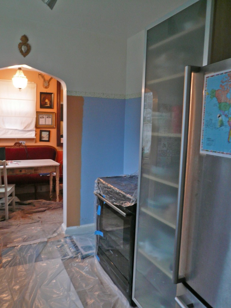
Kitchen before demolition of partition wall

Kitchen before demolition of partition wall

The partition wall may also hide pipes, air ducts or wires.   Pipes or ducts will be obviously more problematic than wires to reroute.  To avoid having to reroute wires, one possibility is to keep the bottom part of the wall as we did in our project.  The advantages of this are manifold:  the bottom part of the wall offers a support for relocating the electric switches and hiding the wires.   It also provides more storage surface, and, as a noteworthy point, it spares the trouble and the cost of having to redo the floor.

Half-demolished kitchen partition wall with hanging electrical wire

Half-demolished kitchen partition wall with hanging electrical wire

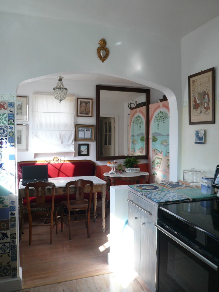
Kitchen and breakfast room after demolition of partition wall

Kitchen and breakfast room after demolition of partition wall

Once you know what is behind the wall and what may need to be moved, you can then decide accordingly on the shape of the new opening above the door – provided that you have kept the top of the wall.  It may be necessary to keep the upper part of the wall to provide symmetry to the other side of the opening, or because a supporting beam crosses the top.  We chose to keep the ribbed vault design of the opening that was present in passage ways throughout the rest the house, but we elongated its shape. It is interesting to see how each type of opening shape can convey a different feeling.  A rounded opening looks definitely more commercial or outdoor oriented, whereas a pointy or diagonal one, as a ribbed vault, looks more refined.  In a modern décor, a square opening would be the usual choice.  In any case, it is worth taking the time to compare the possible designs.

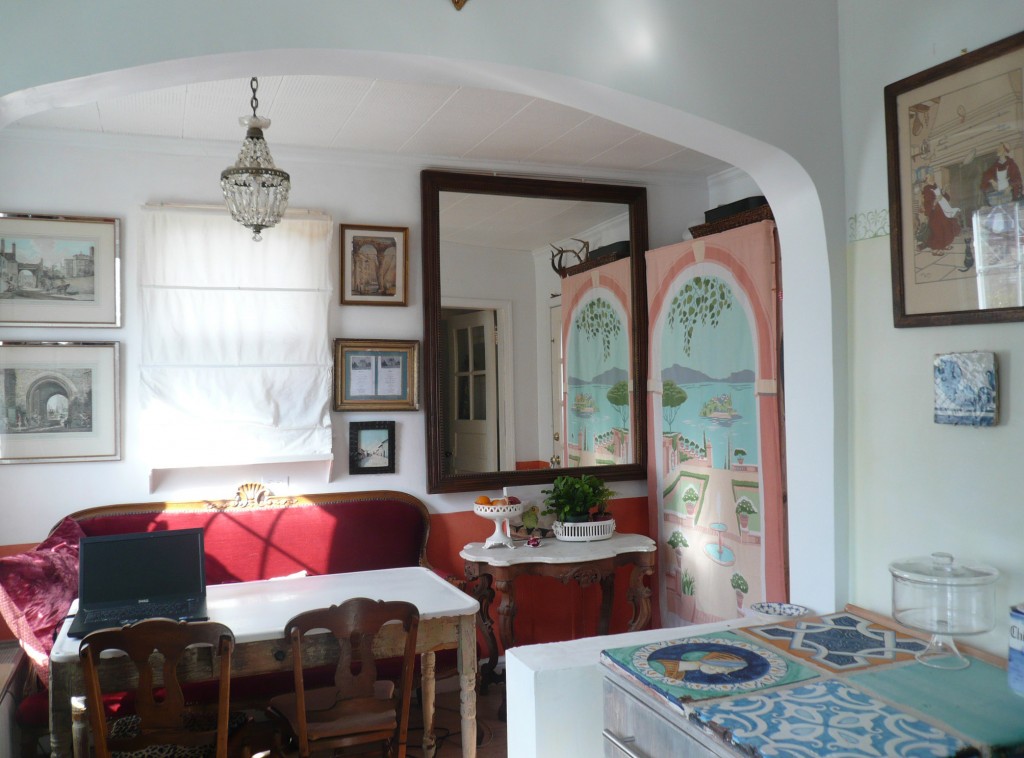
With minimal work, which was more aesthetic than structural in nature, we were able to almost double the size of the kitchen and maximize the use of the floor space, bringing more light and functionality to this well-trodden family space.

Perspective of new kitchen and breakfast room

Perspective of new kitchen and breakfast room

Breakfast room is now part of the kitchen

Breakfast room is now part of the kitchen

1 Comment

Recycling a Wooden Cable Bobbin

Discarded furniture is often tempting to collect with a view to offer it a second life. However, one can quickly accumulate enough broken, comatose, moribund pieces to open a furniture hospital or grave yard.

You should brake for these abandoned patients, but refrain from picking them all up!  Some are not worth your time, and others are too far along in their path to decomposition. As heart-breaking as it is to pass up on free furniture, you must become firmly selective and keep an eye out only for the true treasures in disguise that deserve an unexpected rescue.

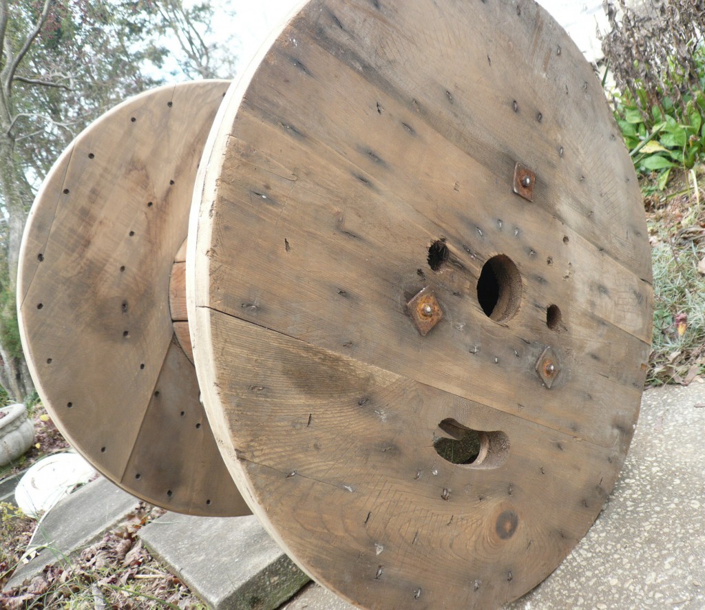
This is how I spotted an old wooden cable bobbin by a dumpster.  I thought to myself: “What a shame to reject such a nicely made spool!”.   My windfall was neither an artistic nor a valuable piece; nevertheless, I envisioned an original side table showing a patina and a character of its own, in my informal sun-room.

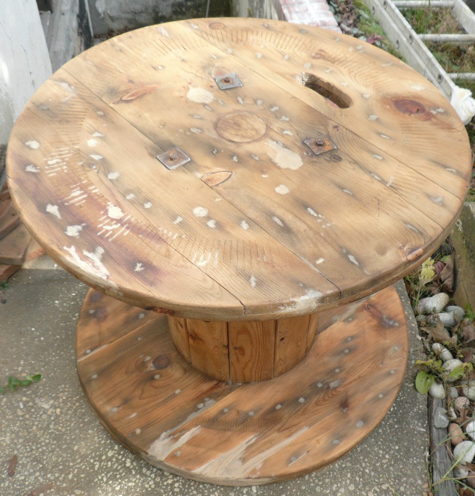
Raw wooden barrel

Raw wooden barrel

The workmanship and the cleverness of this functional object would be salvaged and given a second life.  However, before getting carried away with my ideas, I needed to evaluate whether it was reasonable to complete the repair given the short amount of time I had available.  I found that the object’s repair could be done in three relatively painless steps:

  1. Sand the entire surface, fill the small holes and cracks with wood putty, and close the larger holes with wood plugs;
  2. Paint the filled spots to hide the white putty;
  3. Stain and varnish the entire surface.

From there, I hoisted the bobbin into my car, taking the worms and slugs that had made it their dwelling along for the ride.

The Repair Process

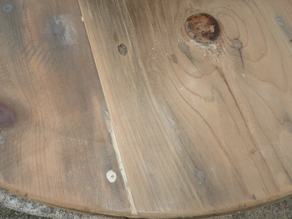
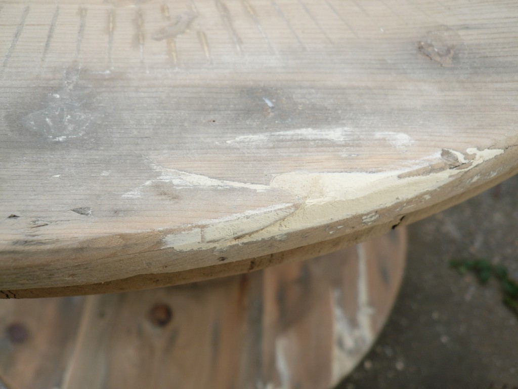
My first task was to sand the surface, but before I could do so, I needed to hammer down every nail and staple.  Once sanded, I inserted putty fillings into the noticeable crevices and holes of the boards.

Top showing putty filling

Top showing putty filling

Edge showing putty filling

Edge showing putty filling

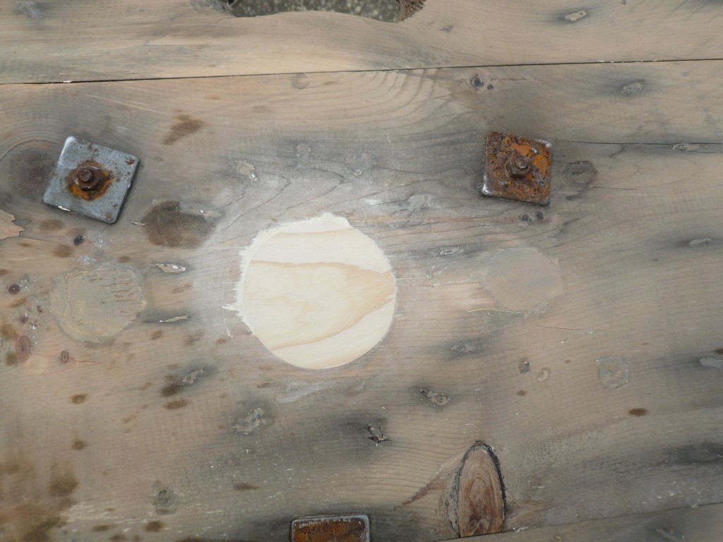
I glued pine plugs inside the larger holes and filled their contour with wood putty. Another sanding round removed the excess of putty.

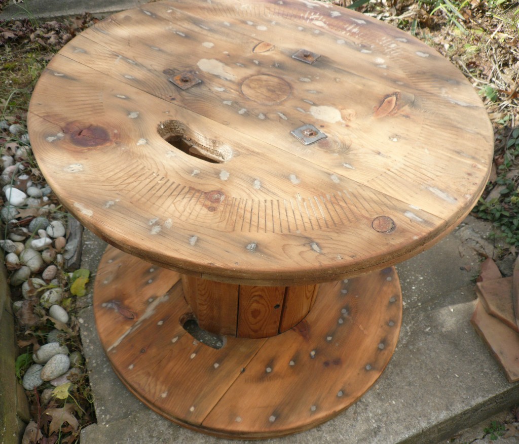
Wooden plug installed in center top

Wooden plug installed in center top

All holes are filled, main plug is stained, two smaller plugs are in.

All holes are filled, main plug is stained, two smaller plugs are in.

In order to eliminate the white marks of the putty, I painstakingly touched up each filled spot with an artist acrylic paint mimicking the shade of the neighboring wood color; it ranged from creamy white to grey brown.  The large wood plugs were stained with a wood stain to let the grain design show through, and again, I tried to reproduce as faithfully as possible the adjacent wood color.

All holes are filled, plugged and stained

All holes are filled, plugged and stained

Finished stained top

Finished stained top

The easiest task remained: staining the entire surface with diluted latex off-white paint. I did not use oil-based paint in order to avoid an inexorable yellowing of the tint.  I had in mind a milky grayish/café-au-lait color, totally sheer to let the pine knots, the irregularities of the wood, its grain design, and its age show through the finish.  Once my very liquid mix was ready, I rubbed it firmly into the pores and openings of the wood.  In some areas, I repeated the application of the mix, especially in the spots that had marred the top of the table.

Finished stained top

Finished stained top

I waited overnight before coating the table with a flat acrylic finish that is invisible, yet protective and non-yellowing.  Three coats of it were applied.

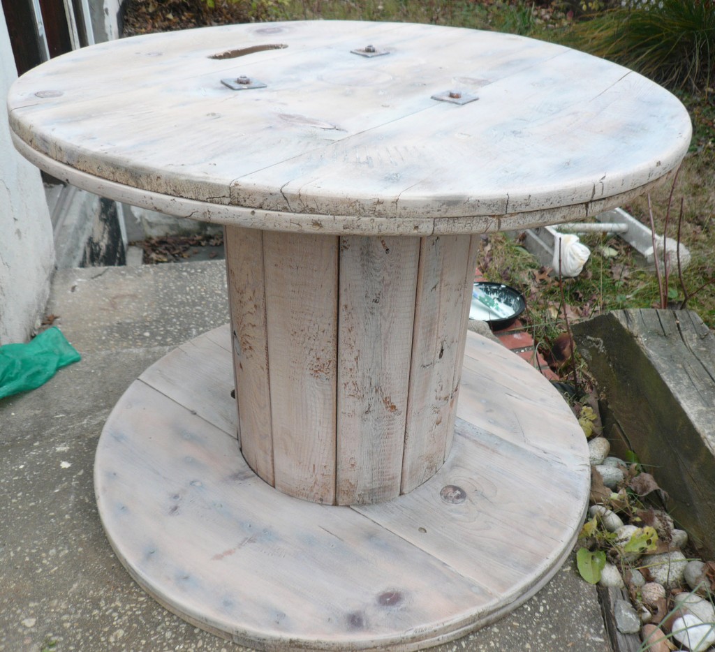
The bobbin serves a new function now, and because of  its shape and first destination, it is reminiscent of the Russian constructivism period!

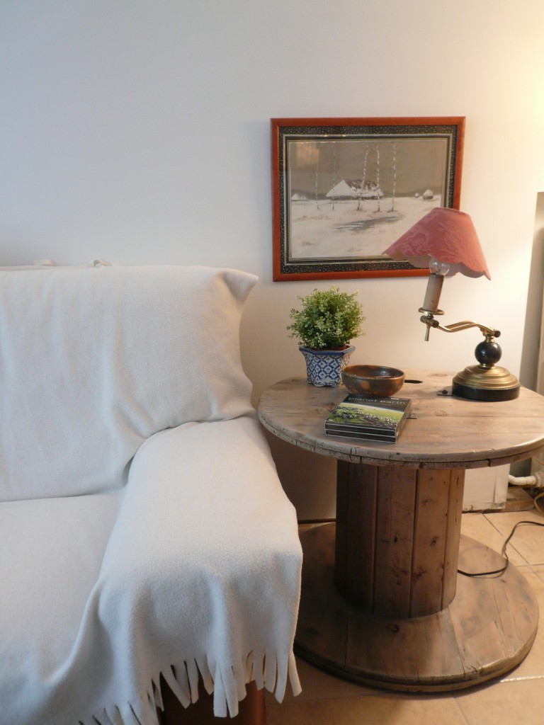
Finished bobbin/ table in place

Finished bobbin/ table in place

Leave a comment

Murals in the City

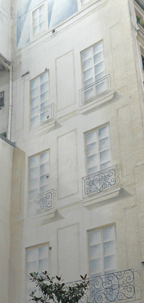
Many large murals adorn the French urban streetscapes.  Some serve a sole decorative purpose: to transform unsightly blank walls or hide temporary renovation work.  Others are political or whimsical.  However, when it comes to the beautification of the city, the murals are a class of their own, evoking a feeling of admiration, amusement, or serendipity to all passersby.   As a “Thank you” to the artists and patrons who toil to bring fine art to the streets, I want to share with you their masterpieces.

Paris trompe l'oeil windows on blind wall

Paris trompe l'oeil windows on blind wall

Facades in Paris

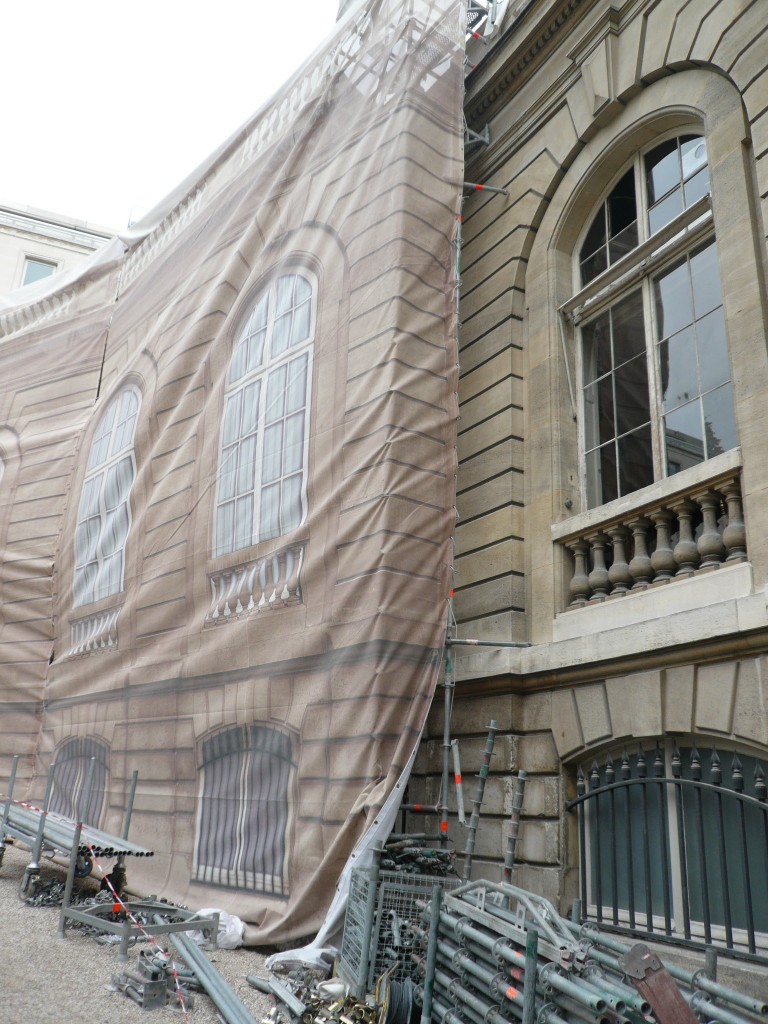
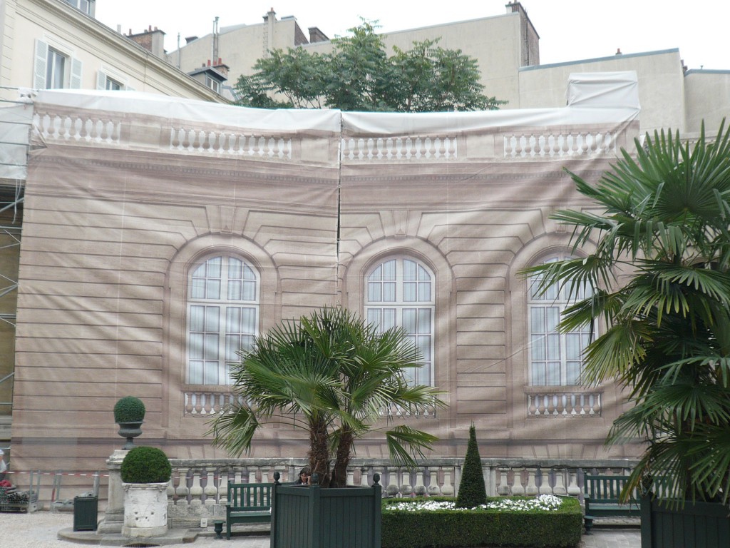
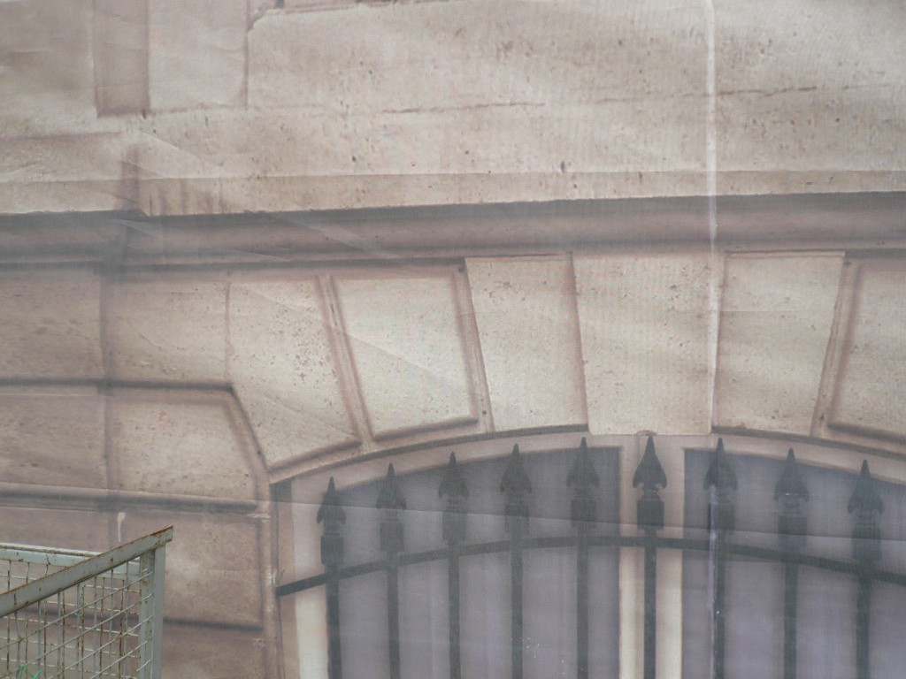
The following are other manifestations of trompe-l’oeil paintings done on drop clothes. Historical monuments undergoing facelifts are sometimes hidden under gigantic drop clothes mimicking to perfection the actual appearance of the facade, to a point where the eye can become deceived.  Such extreme care spares the monuments’ unsightly plastic coverings for the duration of their repair, and does not deprive the tourists of its architectural beauty and classical lines.  In this case, the trompe l’oeil does not suggest something unreal, but replicates and perpetuates the splendid hidden face of the monument.

Undergoing renovation work at the Jacquemard-Andre Museum in Paris.

Jaquemart-Andre museum, in Paris, under renovation

Jaquemart-Andre museum in Paris, dropcloth with faux facade

The work is hidden under gorgeous faux painted drop clothes replicating the classical architecture of the museum façade.

Jaquemart-Andre museum: detail of faux stonework and window.

Jaquemart-Andre museum: detail of faux stonework and window.

Facades in Lyon

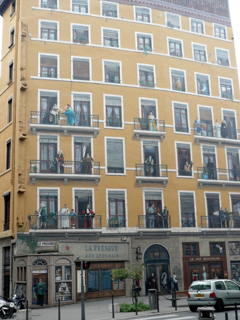
Building of the “Lyonnais” located in Lyon,  France.

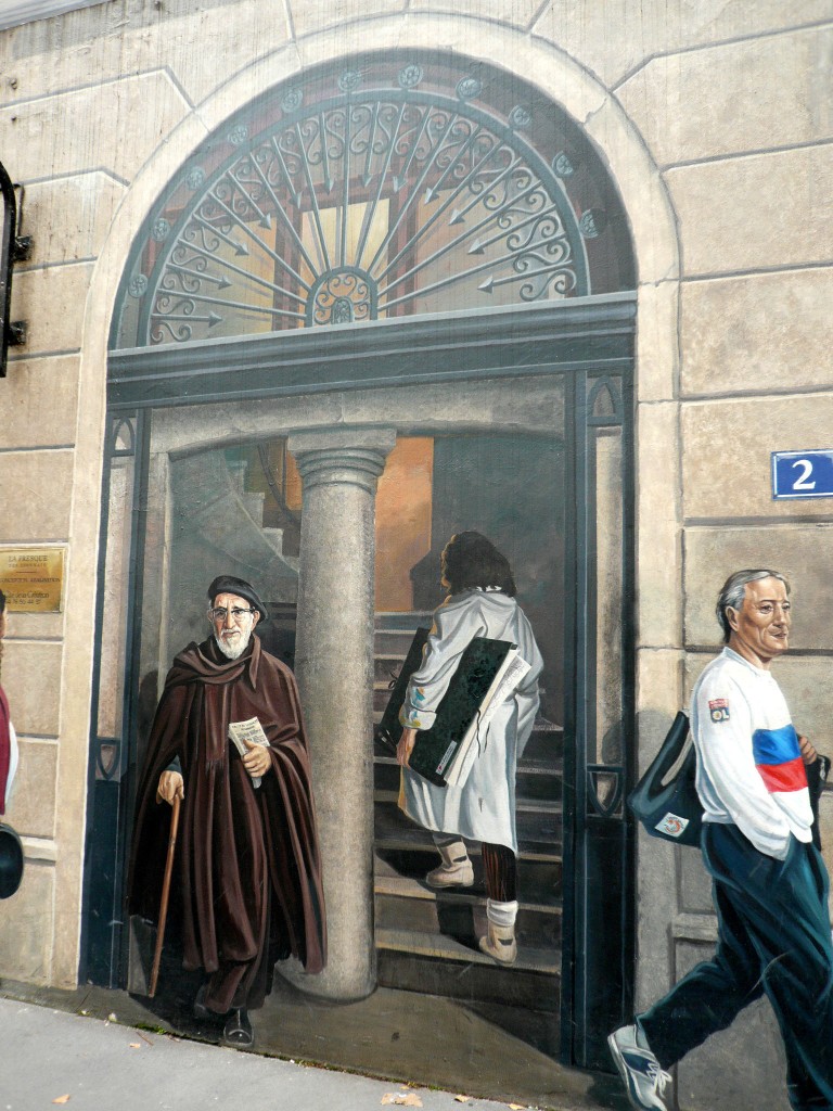
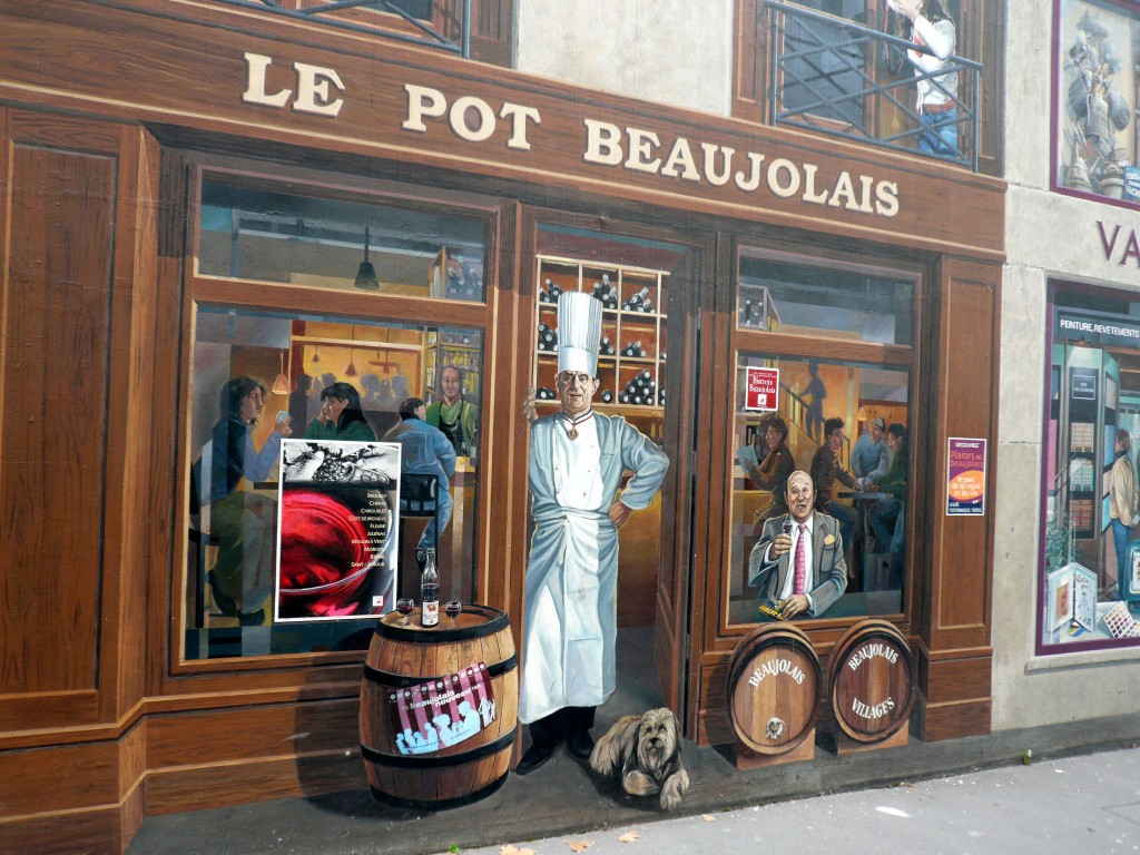
Lyon, France ,building of the LyonnaisThe building portrays on its facade the 31 most famous Lyon denizens: they appear in a chronological order, the most ancient being on the highest floor of the “Trompe l’oeil” façade.

The Lyonnais building, detail of the entrance with the famous "Abbe Pierre"

The Lyonnais building, detail of the entrance with the famous "Abbe Pierre"

Lyonnais building: detail of a first floor faux painted  restaurant.

Lyonnais building: detail of a first floor faux painted restaurant.

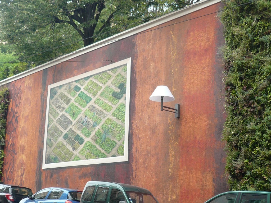
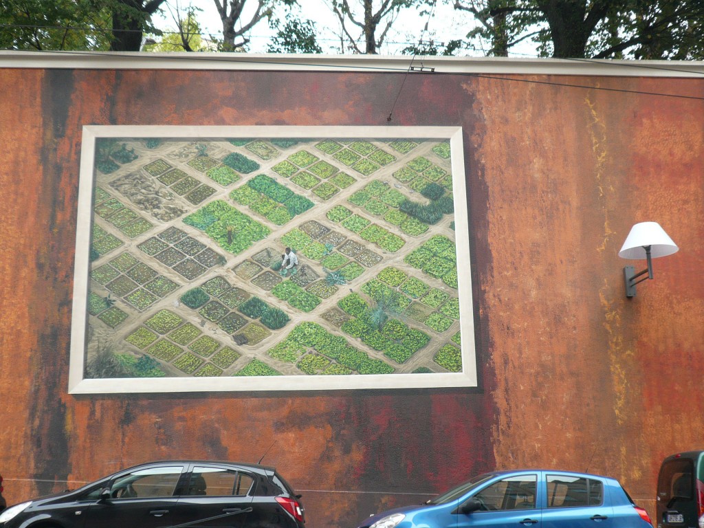
“La fresque vegetale lumiere”, vegetal and light fresco. This very long wall covered partly with vegetation and lights, is also located in Lyon France.

Lyon, mural of Mali crops from a side angle

Lyon, mural of Mali crops from a side angle

Lyon, mural depicting aerial view of crops in Mali with farmer

Lyon, mural depicting aerial view of crops in Mali with farmer

Lyon, close up of mural with Mali crops

Lyon, close up of mural with Mali crops

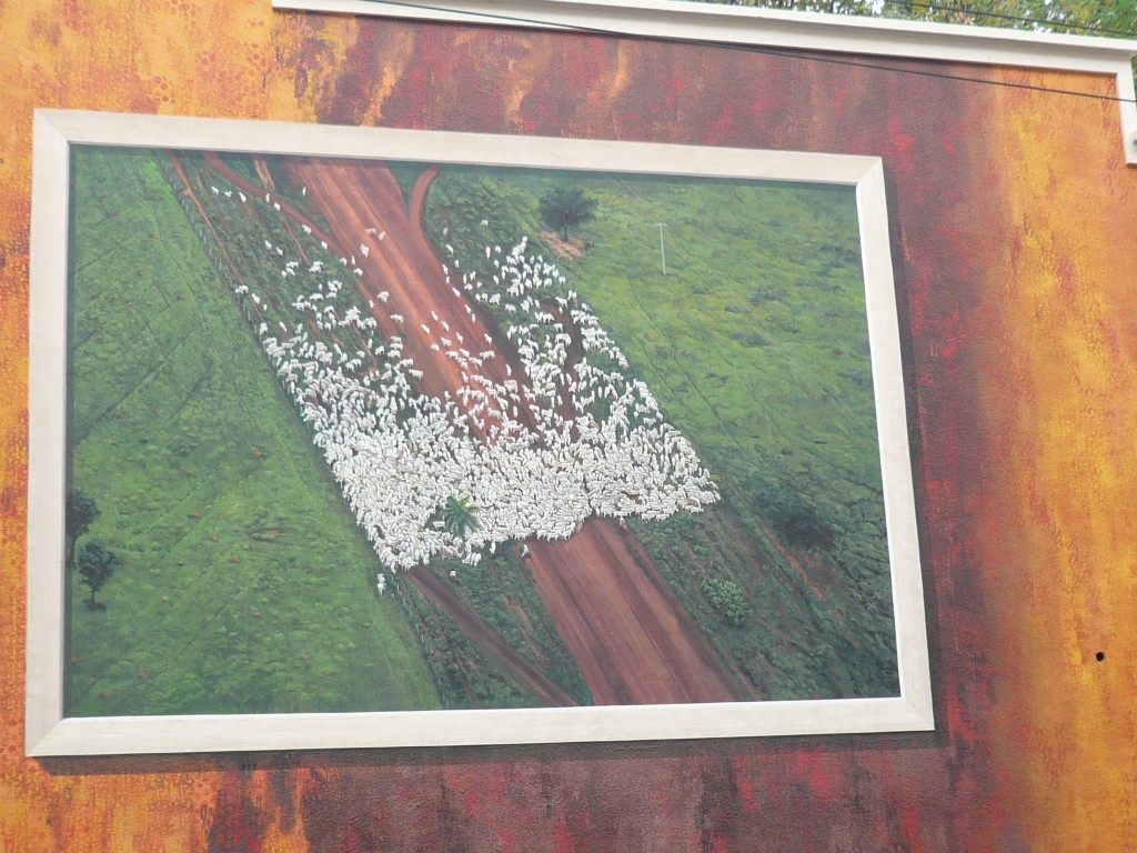
It is another creation by muralists reunited in the “Cite de la creation” company, based in Lyon, France. These artists have reproduced pictures taken by Yann Arthus Bertrand, representing threatened areas of the planet; they are respectively situated in Mali, Argentina, and Brazil.

Lyon, aerial view of Mato Grosso in Brazil, with cow herds

Lyon, aerial view of Mato Grosso in Brazil, with cow herds

Lyon, detail of the Mato Grosso mural

Lyon, detail of the Mato Grosso mural

Between each picture are mimicked the various tones of earth that are typical of those regions. The lights come from huge wall sconces covered with lampshades to provide a more intimate atmosphere.

Leave a comment

Finds in the Parisian Fleas

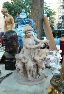
19th Century Terra Cotta Statue

19th Century Terra Cotta Statue

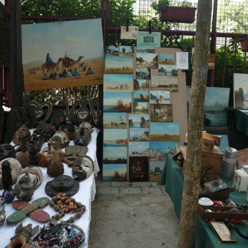
Every day, Parisians find dream objects or utterly-delightful treasure troves in the flea markets, or “les Puces” as we name them. A good eye can spot among rejected objects a fine painting that needs a little TLC, or a ravishing terra cotta statue (see picture). Among treasures I can also mention: Baccarat glasses, 18th century Indian Company porcelain dinnerware, old precious fabrics, Art Deco pieces, rare books, 17th century original drawings, international art, fresh-looking watercolor painted over a century ago for decor or ornament projects, old tools, or magnificent sculpted furniture. And if you are in luck, you may get your find for a song.

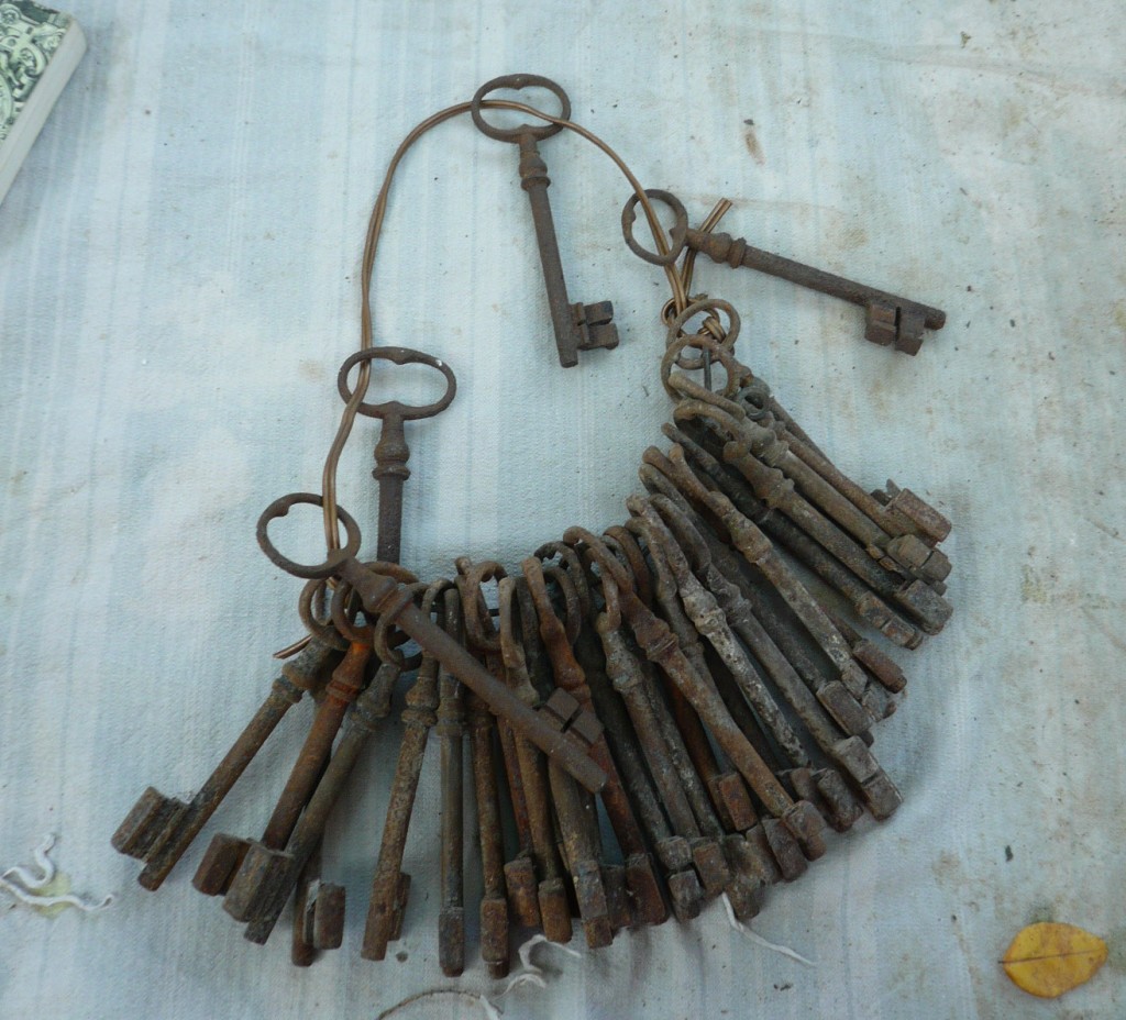
The flea market is the best place to find what you are not looking for, or to drive out your deepest, most oppressed desires for things you do not need. You were once unaware of your soft (yet pressing) spot for keys of all shapes and ages, or that you could develop an obsession with door handles or miniature wild hogs. But now, you know it and can fully assume it. Since nobody is around to judge, you can loosen up and stare at a painting with a large corner missing, painted by a blind person. What sheer delight! You eventually realize that as revealing as these besetting sins may be (which become less besetting when you start frantically collecting country-side armoires), you share with the vendors the same forceful passion for these treasures.

Set of Old Keys

Set of Old Keys

Deer Trophies

Deer Trophies

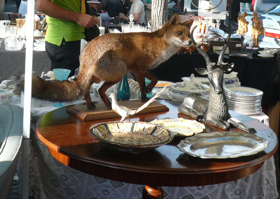
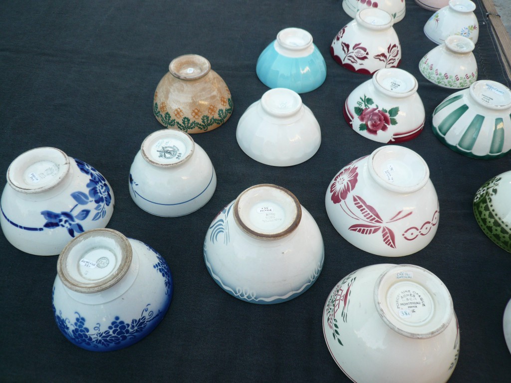
I was in Paris last month, and it was amusing to witness vendors forbid passersby from photographing their items, which in one particular case included a broken prosthetic leg, deer trophies, and miniature cars rescued from a fire. What are they fearing? Robberies? Counterfeiting? Is there something I’m missing? I also noticed that these markets are becoming more attractive to buyers from abroad. The Chinese arrive on the heels of the Japanese, who are still trying to corner the market of 1930s stoneware bowls and plates, jumping avidly on broken ivory napkin rings and silver-played dishes damaged down to the metal.

Fox, Pheasant and Deer Lost Amidst Porcelain

Fox, Pheasant and Deer Lost Amidst Porcelain

1930s Bowls

1930s Bowls

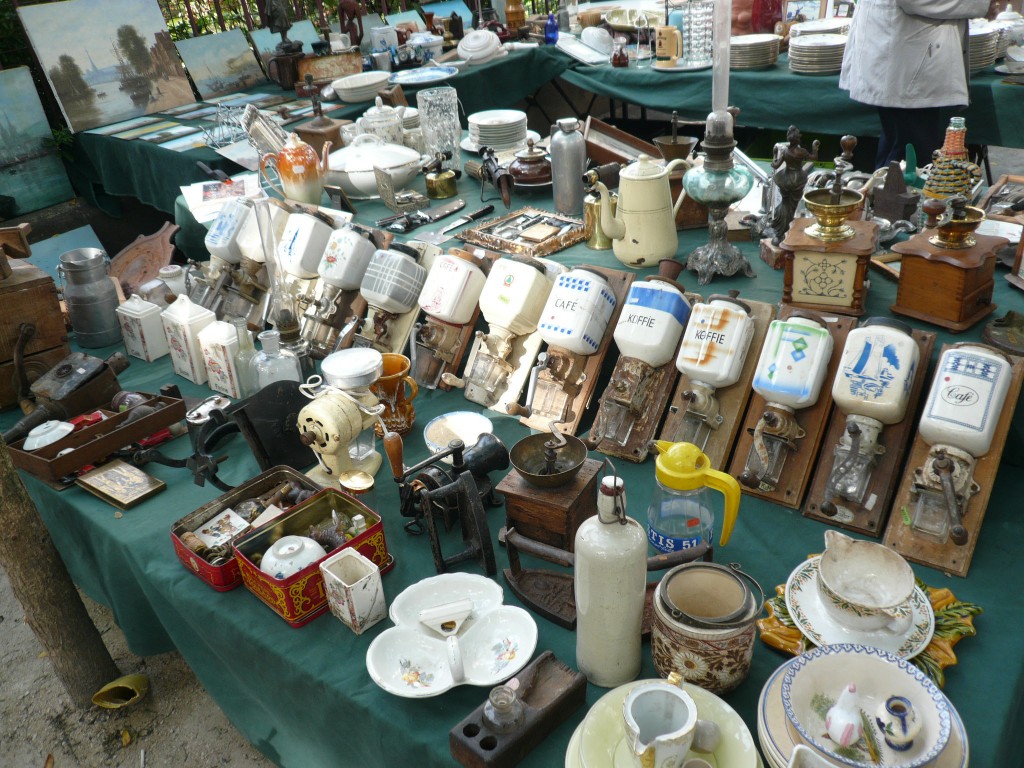
Wall-mounted Coffee Grinders

Wall-mounted Coffee Grinders

Flea markets are wild communions of long-lasting or repressed desires, and I am convinced that one goes to the flea market to cajole inadmissible inclinations; it is a sort of open-air loony bin with self-administered treatments. Long live the spirit of rag pickers!

Orientalist Paintings

Orientalist Paintings

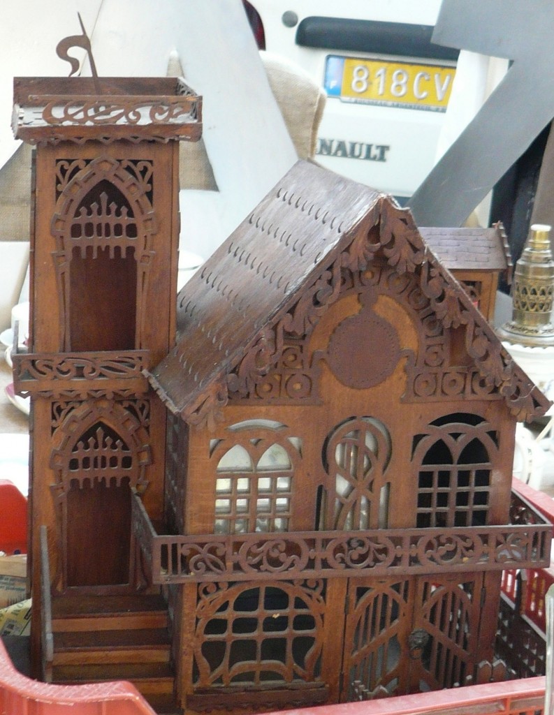
Miniature 1910 Guimard-style House

Miniature 1910 Guimard-style House

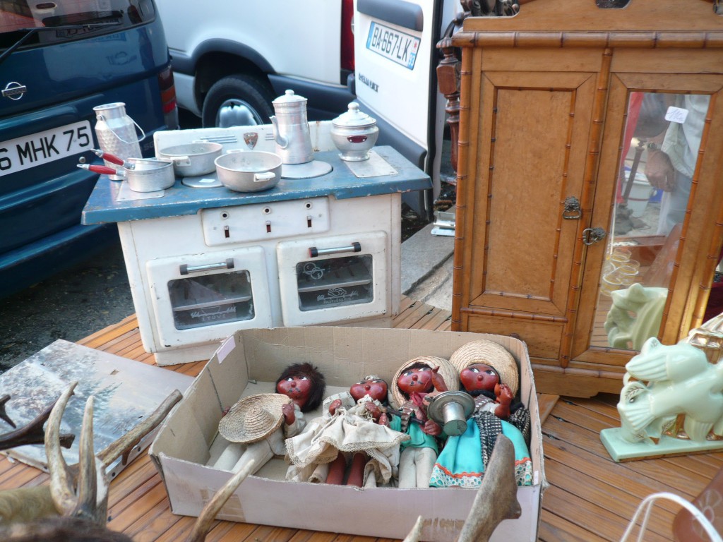
Miniature Stove and Armoire

Miniature Stove and Armoire

Leave a comment

Please Change my Upholstery!

Why do so many armchairs have to be upholstered in ugly or nondescript fabrics?  A fabric should impart your seats with a timeless note of color and elegance, not become a liability to your interior.

Kilim Chair

Kilim on a Victorian sleeper chair

Follow simple rules when picking a fabric: debate first if you are more comfortable with a solid color, or a geometrical, floral or ethnic pattern, such as Cashmere, Suzani, kilim or Ikat.  Take into consideration the style of your furniture, the palette of your walls, and your floor colors.  A well-chosen fabric can enliven a room as much as a painting can.

Strive to select the best quality; a good upholstery fabric should last at least one generation.  To this end, check its resiliency and thickness, and ensure its lightfastness.  A measure of lightfastness can be found on the fabric’s label, and is graded from 1 to 5 for American fabrics (1 being the very poorest) and from 1 to 8 for European ones.  Inquiring about the grade of a fabric is not ludicrous; for example, an attractive cherry silk velvet with a tempting price tag could soon turn to a dirty-looking grey brick, due to a loss of its pigment color.  However, high-grade furnishing fabrics of one hundred years of age or older still boast surprisingly fresh and vibrant colors.  Silk is yet another story; it is notorious for burning under exposure from the sun or the moon, regardless of quality.  Nowadays, even reputable fabric makers sell lower-quality fabrics to better suit consumerism.  If a trendy yet low-grade fabric entices you, you may think about using it for slipcovers; it will be less costly than reupholstering, and you will not have qualms about throwing it away after it wears out.

Crimson Silk Velvet

Conversation around a crimson silk velvet upholstered Louis XV chair.

The shape or style of your seat plays a considerable role in the selection of a fabric.  Pick a fabric that contrasts in intensity with the wood frame color to showcase the upholstery.  Similarly, the shape and proportions of the seat need to be studied before deciding on stripes, large patterns, period fabric and so forth.  The idea is to balance pattern and shape, or to compensate the shortcomings of a chair with a surprising or beautiful fabric that will bring forgiveness to it.  An oversized armchair will be weighed-down by a large pattern fabric, which would be better suited on a small chair.  Designs such as Gingham or Toile bring freshness and a little whiff of happiness to an ambiance; silk velvet conveys softness, luxury and refinement.  Brocades, damasks and lampas are equally ultra-luxurious, and by their sheer presence, set a precious tone even in a monastic room.  For a surprise and contemporary effect, two different fabrics could be used on the same piece; or, you can untraditionally appropriate hammam sheets or mattress fabrics to upholster your seats.  An appreciation for these combined considerations would allow you to bring off your décor.

Tapestry Armchair

Real and fake cherries on tapestry velvet armchair

Blue Settee

Gold trim twisted around settee frame

My creed is that less is more.  The furnishing fabric needs to be underlined by a completing trimming that should not overwhelm it, but just set it.  Using a braid that is too heavy will blur the clean contrast fabric/wood frame of the seat.  Trimming may also serve to create a pattern in the center of the seat or on its back, where a tapestry pattern was often displayed in the past.  Additionally, a trim can be twisted around the pad covering the frame of a settee or armchair (head rest, armrest and their continuation), bringing some salt to its upholstery.

Lastly, it is visually pleasant to display contrasting fabrics or trims to break the monotony of a matching set of furniture; this effect plays the characteristics of the furniture and fabrics against one another other, hence highlighting their individual traits.

Here are some illustrations of these ideas: take a seat!

Leopard Chair

Leopard-occupied Victorian chair

Pillows

Daydream fabrics on pillows

Brocade Silk

19th century brocade silk

A Bientot!

Leave a comment